When building a character sheet, it’s easy to get lost. What do I do? How to get started? This series will present the way to go – at least one way to go.
The sheet we are designing is for the TurboPulp game system. While this is a touch self-serving, since it’s my game and I need to build a sheet for it, most of the procedures are transferable to whatever sheet you’re designing.
The next roughly two months of articles, at one per week every Thursday, will be focused on building this sheet from scratch, occasionally referring to the very detailed reference guide for character sheet design on this site. This guide stats with this post.
First Step, Mock Up The Sheet
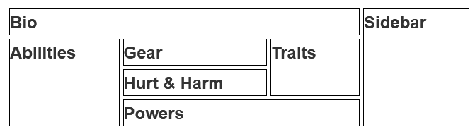
The absolute first step should be planning out the rough direction of the sheet. Don’t just jump in and start building – start with a design, and maybe mock up the design from scratch. Here’s a sheet very similar to the one we will start to build.
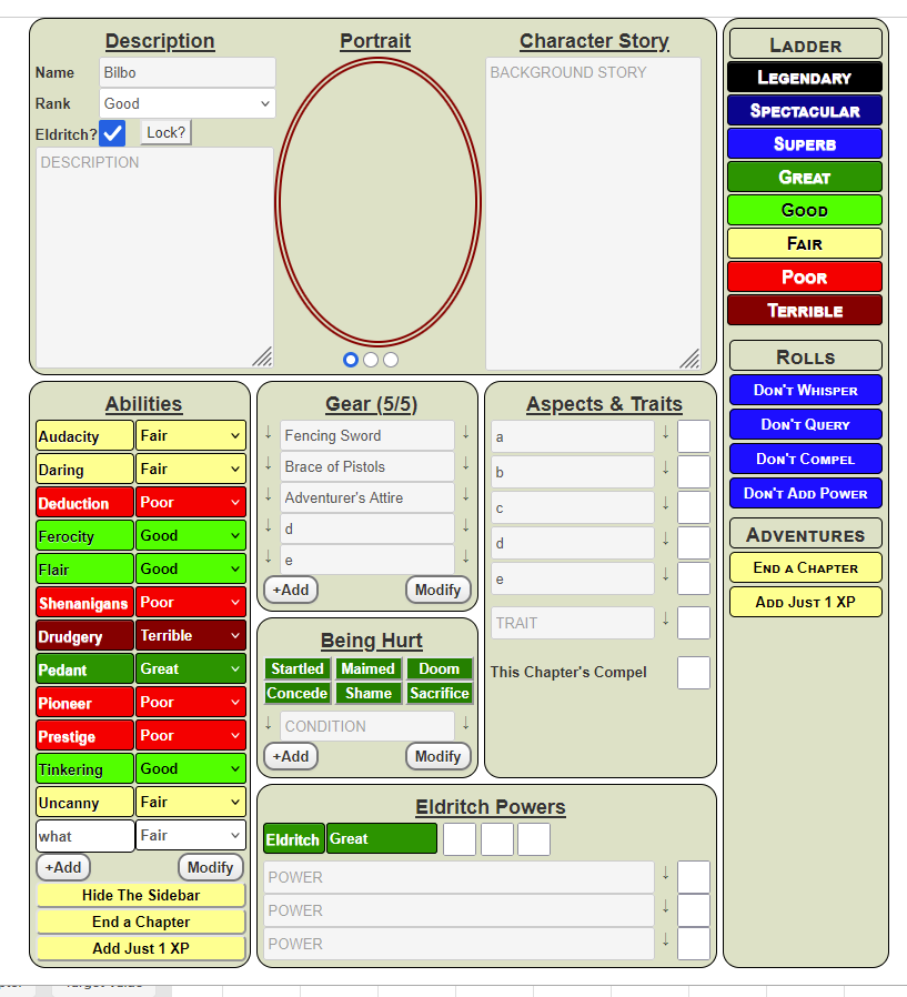
Don’t worry about the specifics on the sheet. Some of this layout will change, and your own sheet will be different, but the process is going to be useful to you.
CSS Grid Layout
Now you have the layout of the sheet, look at it and see if it can be broken down into a grid-style layout. We can see a grid layout here, immediately. See the coloured boxes?
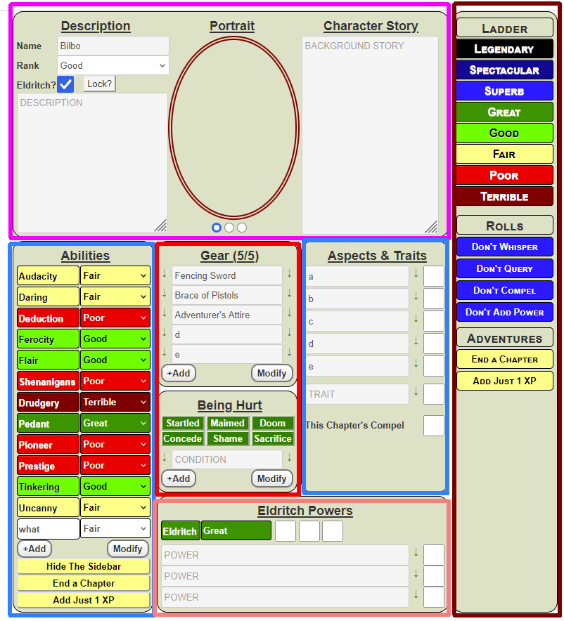
We need to think about how to create a layout like that. It turns out to be surprisingly easy.
CSS Grid Layout
CSS Grid is incredible useful for creating sheet layouts at every level – you can use it when looking at the sheet as a whole, and also for sections within the sheet. You can nest grids within each other. (We’ll be doing that later.)
To start with, let’s ignore the items that cross multiple columns. We’ll add them in just bit.
Build the HTML Items
First, lets build a div for each grid-item. That looks like this:
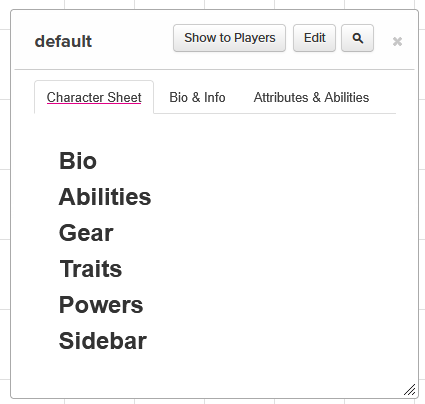
Very bland, but the goal here is just to show where the grid items are. The HTML code for that is
<div class="container">
    <div class="bio">
        <h2>Bio</h2>
    </div>
    <div class="abilities">
        <h2>Abilities</h2>
    </div>
    <div class="gear">
        <h2>Gear</h2>
    </div>
    <div class="traits">
        <h2>Traits</h2>
    </div>
    <div class="powers">
        <h2>Powers</h2>
    </div>
    <div class="sidebar">
        <h2>Sidebar</h2>
    </div>
</div>Code language: HTML, XML (xml)
Each div there will late expand to include all the code for that section, but for now we just need text so we cans see where that item is.
CSS The First Pass
Now we have the basic divs we can arrange them. First, we’ll use some simple CSS code to arrange them.
.container {
    display: grid ;
    grid-template-columns: repeat(4, auto);
    gap: 5px;
    width: 650px;
}
.container div {
  Code language: CSS (css)
That looks like this:
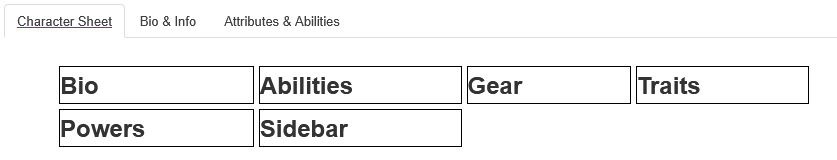
Here we have every grid item, and because of grid-template-columns command they are arranged n 4 columns. The gap command puts a small gap between each column and row, while width constrains them to the standard width a character sheet is opened at.
That isn’t exactly what we want – the bio and powers section should span several columns. There’s more than one way to do this, and we’ll show one handy way.
Using Grid Areas
First, we give each div a grid name, like this:
.container .bio {
    grid-area: bio;
}
.container .abilities {
    grid-area: abilities;
}
.container .gear {
    grid-area: gear;

}
.container .harm {
    grid-area: harm;
}
.container .traits {
    grid-area: traits;
}
.container .powers {
    grid-area: powers;
}
.container .sidebar {
    grid-area: sidebar;
}Code language: CSS (css)
That looks kinda tedious, but we’ll be able to put more code in those sections later. Then we add the grid-template-areas command like this:
.container {
    display: grid ;
    gap: 5px;
    width: 650px;
    grid-template-areas:
        "bio        bio     bio     sidebar"
        "abilities  gear    traits  sidebar"
        "abilities  harm    traits  sidebar"
        "abilities  powers  powers  sidebar"
}Code language: CSS (css)
Notice we create an imaginary layout using the grid-areas as they are written in those declarations. If something spans multiple columns or multiple rows, just write it again. That looks like this:
Notice we now have the columns roughly where we want them. Something that’s really important to know: the grid items will enlarge up and down to fit their contents. So those grid items will grow to fit their contents.
So we have the basic layout, and we’ll see how to proceed in the next post.
Styling Those DIVs
You can create common styling rolls for all those divs, for example colouring the boxes so that it like this:
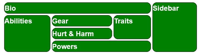
For example, you can do this:
.container > div {
    border: 1pt solid black;
    border-radius: 15px;
    background-color: green;
    color: white;
}Code language: CSS (css)
The > symbol: is the child combinator, and means the shown CSS is applied only to the elements which are directly ‘below’ the preceding element – here divs that are directly below .container have the above styling applied. This stops divs that are deeper in the structure getting that styling.
You an apply whatever styling you like, but nite that roll20 might already apply some styling. By default, roll20 headings are black and you’d need to specifically override them to do this. See Inheritance and Specificity. The main point: you don’t have to target each div specifically to change it.
Changing the Layout
One of the features of using CSS Grid, is how easy it is to change the layout. Imagine we wnted to change the layout to look like this:
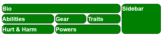
All we need to do for this is change the grid-template-areas command, like this:
grid-template-areas:
        "bio        bio     bio     sidebar"
        "abilities  gear    traits  sidebar"
        "harm       powers  powers  sidebar"Code language: CSS (css)
And that’s it. It’s easy to change a layout once you have it designed, and we’ll no doubt do that.