Repeating sections present a problem in CSS Grid layouts, and I’ll explain what that is, and show two ways to get around it.
First, let’s say you have a repeating section to manage weapons, and it has a table of headings above it. Something like this:
<div class="attacks">
    <h4>Weapon</h4>
    <h4>Range</h4>
    <h4>Damage</h4>
    <h4>Hands</h4>
    <fieldset class="repeating_weapons">
        <input type="text" name="attr_name" placeholder="NAME">
        <input type="number" name="attr_range" value="0">
        <input type="number" name="attr_damage" value="0">
        <select name="attr_hands">
            <option selected>One-Handed</option>
            <option>Two-Handed</option>
        </select>
    </fieldset>
</div>Code language: HTML, XML (xml)
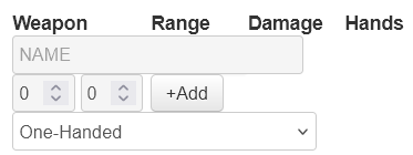
With no styling, that looks like this:

We look at that and think, “Okay, we need to make the headings line up on one row, and match their widths to the fieldset items. But also, it would be nice to change the width of the weapon items. This looks like a perfect opportunity to create a 4-column Grid.”
So we create this grid:
.attacks {
    display: grid;
    grid-template-columns: 100px 60px 60px 100px;
    gap: 0 5px;
}Code language: CSS (css)
and then get this

That is a complete mess! We can see the text input and select elements are not the correct widths – a common problem which we can easily fix. But the rest is just chaos – how do we fix that?
The Easy Fix
We don’t actually need to know what happened. We know from earlier posts that you can reuse the same grid, so thats what we do here. We change the HTML like so:
<div class="attacks">
    <div class="weapon-grid">
       <h4>Weapon</h4>
       <h4>Range</h4>
       <h4>Damage</h4>
       <h4>Hands</h4>
    </div>
    <fieldset class="repeating_weapons">
        <div class="weapon-grid">
           <input type="text" name="attr_name" placeholder="NAME">
           <input type="number" name="attr_range" value="0">
           <input type="number" name="attr_damage" value="0">
           <select name="attr_hands">
               <option selected>One-Handed</option>
               <option>Two-Handed</option>
           </select>
        </div>
    </fieldset>
</div>Code language: HTML, XML (xml)
Notice how we put the headings inside a div, then the items inside the repeating section inside a div, and applied the same class to both. And that class has the grid assigned to it. Here’s the CSS:
.weapon-grid {
    display: grid;
    grid-template-columns: 100px 60px 60px 100px;
    gap: 0 5px;
}
.ui-dialog .charsheet .attacks input,
.ui-dialog .charsheet .attacks select {
    width: 100%;
}Code language: CSS (css)
We needed to add some extra class-names on the input so we could override the styling that roll20 automatically assigns to number inputs. That gives us this layout:

That is so much better. We’d probably want to reduce the height of the inputs or increase the height of the select to line everything up, but that’s not the topic here. We have our grid layout.
Note: I’m going to explain why the first attempt went wrong, and explain a “better” way to solve it, but I like this approach and tend to use it a lot anyway. It’s your preference which you prefer.
Understanding What Happened
You might look at the HTML, and see this:
    <h4>Damage</h4>
    <h4>Hands</h4>
    <fieldset class="repeating_weapons">Code language: HTML, XML (xml)
Aha, there’s a fieldset element in the area we have our grid. Each element is placed in the grid, so the fieldset is assigned one column, and everything inside it is a level deeper and not affected by the grid.
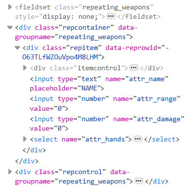
That’s on the right track, but it’s not what happened. When you examine a sheet containing a fieldset, you’ll see the fieldset itself is never placed on the character sheet! A fieldset is a set of instructions, telling roll20 how to build each row of the repeating section. It creates a repcontainer div which itself contains a repitem div for each row of the repeating section, and then a repcontrol div to contain the Add and Modify buttons. When we look at the code of a live sheet, this is what we see:

Notice how the fieldset has display:none; because it is not part of the sheet. Instead, we have the repcontainer, and inside it both the repitem and repcontrol divs.
The data-groupname property is also there, which gives us another way to access repeating sections.
Fixing It Now
So, we can now use display: contents to make parts of the repeating section invisible to the grid. But we have to use it multiple times, like this:
.attacks .repcontainer,
.attacks .repitem,
.attacks .repcontrol {
    display:contents;
}Code language: CSS (css)
The various elements we want to access are inside the repitem, which is inside the repcontainer, so we need to apply it to both of these. The Add and Modify buttons are inside the repcontrol element – we want to control where those buttons are placed, so that should go here too.

If you want to use data-groupname, you can do this with the same effect. (If you want to be more generic, just place repcontainer instead of data-groupname).
[data-groupname="repeating_weapons"],
[data-groupname="repeating_weapons"] .repitem,
[data-groupname="repeating_weapons"] .repcontrol {
    display:contents;
}Code language: CSS (css)
Conclusion
Repeating Sections can seem tricky to use with Grid, but once you know how to do it, they are simple.
We have also seen how to use data-groupname, which is a handy way to access specific repeating sections directly. You can use that in a lot of situations.
