I’ve presented CSS Grid as a great feature, and it really is, but there are several situations to be aware of. Since it’s Halloween night, it is fitting describe when things go wrong.
Inbuilt Styles in Roll20: Selects and Inputs
It’s pretty common to sort out your grid code and see something like this:

What we have here is a bordered box with a defined width which itself has columns of defined width, where the inputs and selects don’t stick to their allotted space. The middle number input has a different colour purely so you can see it, to show how the first input breaks out of the first column and occupies the same space!
This happens because there are several html elements on Roll20 that have styles already applied, and their specificity is high enough that they’ll override other styles. This is especially common with selects and inputs.
One fix for this is to create declarations specifically for those elements, to force them to stay in their allotted area.
This example uses a 300px width, and gives each column 90px. Here’s one way to do that and get the columns to obey.
.grid-test {
  border: 1pt solid black;
  width: 300px;
  display: grid;
  grid-template-columns: repeat(3,90px);
  column-gap: 5px;
}
.grid-test input[type="text"],
.grid-test select {
    width: 90px;
}Code language: CSS (css)
This quick-and-dirty example would produce the following:
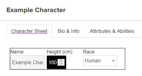
The columns are now kept within their allotted space. There’s a lot more you can do here. For a start, that first column could be bigger to accommodate the name, the middle column doesn’t need to be as wide, and the heights of all elements could be made the same. But, this should illustrate the issue I’m talking about here.
Count the Columns
Another thing to watch out for is to make sure you have counted the number of columns correctly. Grid makes it very easy to organise content into columns, but you know something has gone wrong when you see something like this:
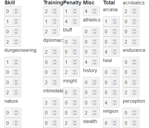
We can see the labels that should be at the start of the column are off by one column each type. We have used CSS like this:
div.skills {
    display: grid;
    grid-template-columns: 100px repeat(5, 50px);
    column-gap: 5px;
}Code language: CSS (css)
But should be:
div.skills {
    display: grid;
    grid-template-columns: 100px repeat(4, 50px);
    column-gap: 5px;
}Code language: CSS (css)
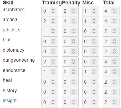
Notice the difference on the grid-template-columns line. There are many ways to end up with the wrong columns, but once you recognise what’s going on, the fix is usually easy. This gives us the expected image:
The Wrong Heights
Let’s say, I start by adding two grids next to each other and imagine it looking like this.
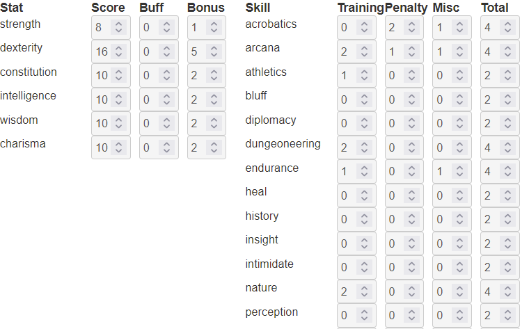
I’m planning to put something in that empty space. So, I add it to the character sheet, and to my horror see something like this:
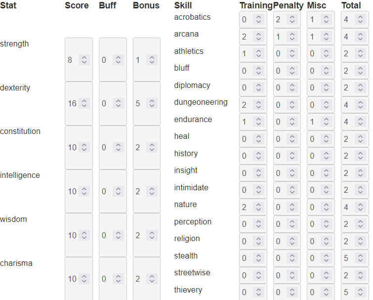
My initial reaction is likely to be something like, “what the hell?”
What has happened is that the browser has recognised one grid is taller than other, and the default behaviour is for them to spread out to fit the available space. This means that first grid has been stretched.
We don’t want it to be stretched like this. Fortunately, it’s an easy fix. We started with CSS like this:
div.stats {
    display: grid;
    grid-template-columns: 100px repeat(3, 50px);
    column-gap: 5px;
}Code language: CSS (css)
We simply need to add one line:
div.stats {
    display: grid;
    grid-template-columns: 100px repeat(3, 50px);
    column-gap: 5px;
    align-content: start;
}Code language: CSS (css)
Align-content allows you how to declare how the height of a grid should be allocated. If it’s not set, the standard behaviour is for it to spread to fit the available space. I have found align-content: start to be the most useful setting, and I assign it a lot.
Wrapping Up, and a Request
So you can see how easy it is to use CSS Grid (it is vastly superior to using tables for layout!), but there are issues that can crop up. If you find any more problems, let me know and I’ll explain how to fix them.
