One thing that will come up again and again with CSS Grid is the concept of a grid-cell. Look at this image from the last post.

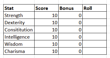
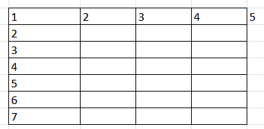
The image is on the left. The middle image above is that same structure put into a more obvious grid (and the icons for the roll buttons removed to make it easier to draw!). You can see each item is inside a box of its own, a grid-cell.
Whenever you use CSS Grid, the thing is placed into a grid (duh!), a grid with a set number of rows and columns. Here we have a grid with 4 columns and 7 rows. That’s going to be important shortly – but one of the beauties of CSS Grid is you don’t always need to know the size of the grid. In this Grid, we specified that there were 4 columns, and it sorted out the number of rows itself.
Addressing a Grid Cell
Now look at that last picture. Whenever you create a Grid, it is assigned a bunch of grid cells, and they each have their own row and column addresses. Look at the cell that contains the word Score. It is the second box along on the first row.
In CSS Grid terms, that means its column starts at the line numbered 2, and ends at the line numbered 3 (the start of the 3rd column). This means its column address is 2 / 3 (start / end), or 2 / span 1 (starts at column 2, and is 1 cell wide).
It always needs a start and end, or start and width, because we are defining the whole column. This is why #5 is shown, because if you defining the final column, it would be 4 / 5.
Likewise we can do the same for the row. Its address there is 1 / 2 (starts at the top of row 1, and ends at the top of row 2), or 1 / span 1 (starts at the top of row 1, and is 1 grid-cell high).
Putting This To Use
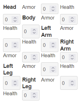
Let’s say you are building a mecha, or something complex armour system which where each body part has its own armour and hit points. Maybe it looks like this:
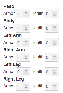
But you want to make better use of space and make those titles on the same row as the text. There is of course more than one way to do it, but lets do it in the way that best illustrates CSS.
The above code starts like this:
<div class="mecha">
    <h4>Head</h4>
    <div class="body-part">
        <span>Armor</span>
        <input type="number" name="attr_head_a" value="0">
        <span>Health</span>
        <input type="number" name="attr_head_h" value="0">
    </div>
    <h4>Body</h4>
    <div class="body-part">
        <span>Armor</span>
        <input type="number" name="attr_body_a" value="0">
        <span>Health</span>
        <input type="number" name="attr_body_h" value="0">
    </div>
    <h4>Left Arm</h4>
    <div class="body-part">
	<span>Armor</span>
        <input type="number" name="attr_larm_a" value="0">
        <span>Health</span>
        <input type="number" name="attr_larm_h" value="0">
    </div>
    <h4>Right Arm</h4>
    <div class="body-part">
        <span>Armor</span>
        <input type="number" name="attr_rarm_a" value="0">
        <span>Health</span>
        <input type="number" name="attr_rarm_h" value="0">
    </div>
    <h4>Left Leg</h4>
    <div class="body-part">
        <span>Armor</span>
        <input type="number" name="attr_lleg_a" value="0">
        <span>Health</span>
        <input type="number" name="attr_lleg_h" value="0">
    </div>
    <h4>Right Leg</h4>
    <div class="body-part">
        <span>Armor</span>
        <input type="number" name="attr_rleg_a" value="0">
        <span>Health</span>
        <input type="number" name="attr_rleg_h" value="0">
    </div>
</div>Code language: HTML, XML (xml)
Each body part is placed in its own 4 column grid. That allows us to change column widths in one place and it affects all at once. It shows you can use the same code in multiple places in a character sheet. If anything else needs those same columns we can just copy the grid class name, and there we have it.
Let’s see we create that flow with CSS. That looks like this:
.mecha .body-part {
    display:grid;
    grid-template-columns: repeat(4, 5rem);
}Code language: CSS (css)
Now we want to move that heading to be the first item on the column. We start by massaging the HTML like this:
<div class="mecha">
    <div class="body-part">
        <h4>Head</h4>
        <span>Armor</span>
        <input type="number" name="attr_head_a" value="0">
        <span>Health</span>
        <input type="number" name="attr_head_h" value="0">
    </div>
    <div class="body-part">
        <h4>Body</h4>
        <span>Armor</span>
        <input type="number" name="attr_body_a" value="0">
        <span>Health</span>
        <input type="number" name="attr_body_h" value="0">
    </div>
    <div class="body-part">
        <h4>Left Arm</h4>
        <span>Armor</span>
        <input type="number" name="attr_larm_a" value="0">
        <span>Health</span>
        <input type="number" name="attr_larm_h" value="0">
    </div>
    <div class="body-part">
        <h4>Right Arm</h4>
        <span>Armor</span>
        <input type="number" name="attr_rarm_a" value="0">
        <span>Health</span>
        <input type="number" name="attr_rarm_h" value="0">
    </div>
    <div class="body-part">
        <h4>Left Leg</h4>
        <span>Armor</span>
        <input type="number" name="attr_lleg_a" value="0">
        <span>Health</span>
        <input type="number" name="attr_lleg_h" value="0">
    </div>
    <div class="body-part">
        <h4>Right Leg</h4>
        <span>Armor</span>
        <input type="number" name="attr_rleg_a" value="0">
        <span>Health</span>
        <input type="number" name="attr_rleg_h" value="0">
    </div>
</div>Code language: HTML, XML (xml)
But then we notice that we have several grids directly following each other, so this can be changed. They can all be put in one grid:
<div class="mecha">
    <div class="body-part">
        <h4>Head</h4>
        <span>Armor</span>
        <input type="number" name="attr_head_a" value="0">
        <span>Health</span>
        <input type="number" name="attr_head_h" value="0">

        <h4>Body</h4>
        <span>Armor</span>
        <input type="number" name="attr_body_a" value="0">
        <span>Health</span>
        <input type="number" name="attr_body_h" value="0">

        <h4>Left Arm</h4>
        <span>Armor</span>
        <input type="number" name="attr_larm_a" value="0">
        <span>Health</span>
        <input type="number" name="attr_larm_h" value="0">

        <h4>Right Arm</h4>
        <span>Armor</span>
        <input type="number" name="attr_rarm_a" value="0">
        <span>Health</span>
        <input type="number" name="attr_rarm_h" value="0">

        <h4>Left Leg</h4>
        <span>Armor</span>
        <input type="number" name="attr_lleg_a" value="0">
        <span>Health</span>
        <input type="number" name="attr_lleg_h" value="0">

        <h4>Right Leg</h4>
        <span>Armor</span>
        <input type="number" name="attr_rleg_a" value="0">
        <span>Health</span>
        <input type="number" name="attr_rleg_h" value="0">
    </div>
</div>Code language: HTML, XML (xml)
Now we need five columns. CSS Grid will put elements into each grid-cell, and headings are no different to other elements. So, we now have:
.mecha .body-part {
    display:grid;
    grid-template-columns: 8rem repeat(4, 5rem);
}Code language: CSS (css)
And in the sheet that gives us
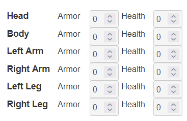
In practice, we might move armour and health out into their own column headings and reduce th3 size of this section even further.
But let’s say we absolutely need those body location titles to be headings above the armour and health scores. What’s the easiest way to do that with CSS Grid?
Negative Addresses
We have already seen we can refer to the column address by its number, like 1, 2, 3, 4, or 5. But we can do this in reverse too: -1 refers to the last address, -2 refers to the one before that, -3 tto the one before that, and so on. For example, if we have 4 columns, that looks like this:
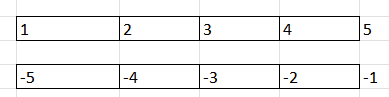
The clever thing is we can use these interchangeably. So if we want something to span an entire row, we can say it starts at the first entry, and ends at the last entry. The easiest way to do that is to use 1 / -1.
If we want to refer only to the final column, instead of using -2 / -1, we could use span 1 / -1. Here the span is before the number of the column, since we are interested in the end or last index.
Looking back at our example, I want those headings to span the entire row. So, I could reduce the columns back to 4 and use this CSS:
.body-part h4 {
   grid-column: 1 / -1;
}Code language: CSS (css)
Then I’m back to this:
You’d probably want to do more styling, like make that heading centred, but that’s not the point of this post.
I use this technique a lot for headings:
.whatever something {
   grid-column: 1 / -1;
}Code language: CSS (css)
Using that grid-column command is a great way to take an element out of a grid structure and make it span an entire row. You can build the grid as normal, and ignore that item because you know it’s going to be taken out of the normal structure and be given its own row,
The Wrong Number of Columns
When using Grid, you sometimes get displays that look confusing. Let’s so I’d added a fifth column, like this:
        <h4>Head</h4>
        <span>Armor</span>
        <input type="number" name="attr_head_a" value="0">
        <span>Health</span>
        <input type="number" name="attr_head_h" value="0">Code language: HTML, XML (xml)
But I’d forgotten there was now an extra column and left the CSS like this:
.mecha .body-part {
    display:grid;
    grid-template-columns: repeat(4, 5rem);
}Code language: CSS (css)
I’d get a display that looks like this:
That’s a mess, but after a few moments of panic, I’d notice the number of columns was only 4 and the headings move along one each row, again showing it is built for a row of larger number of columns. Once the correct CSS is added, I get to the correct display.
.mecha .body-part {
    display:grid;
    grid-template-columns: repeat(4, 5rem);
}Code language: CSS (css)
Messing up Grids in this way is very common (at least in my experience). There’s no need to panic though – the code is all still there, you just have to fiddle with it to get it to display correctly.
A More Complicated Example
Now we are ready to move on to more complex concepts, like laying out a whole sheet and understanding implicit (implied) grids.