In the last two posts, we have seen how easy it is to use CSS to create small sections of columns and how to place items at specific places in the grid. In this post, we’ll use that information to show how to organise the entire layout of a sheet, and also look at the grid-template-areas property to make it even easier.
Let’s say you want to organise a sheet like this:
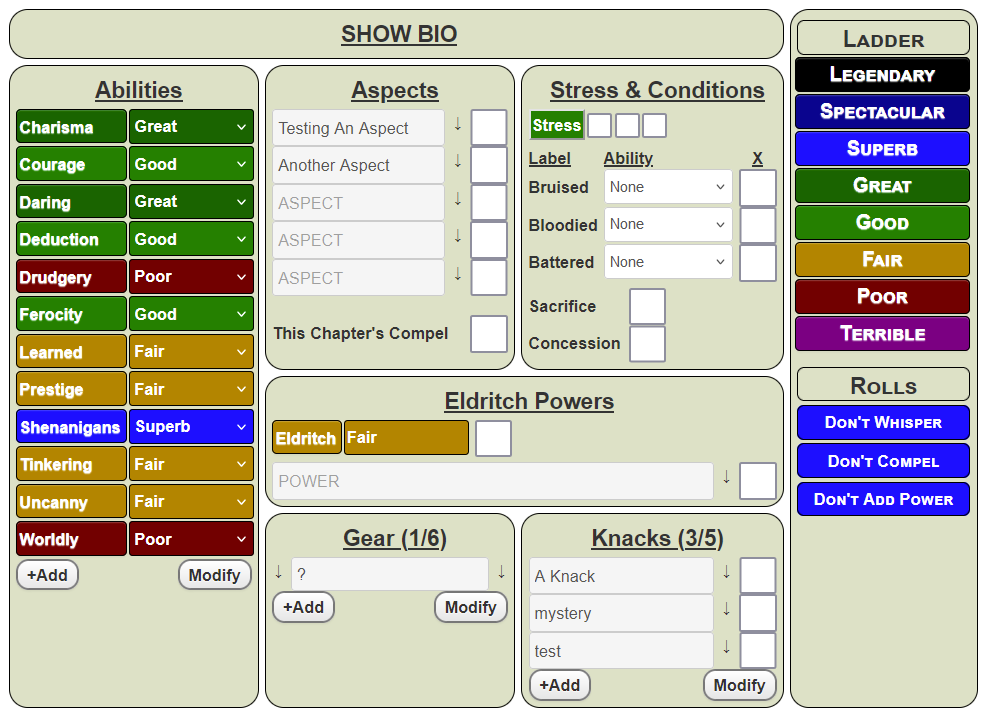
Don’t worry about the specifics – this is just to showcase an example (but if this sheet does interest you, have a look at The Carrington Event). In this post we aren’t concerned with the things on the sheet – we want to get the sheet to contain the same broad shape.
The Overall Shape
The first thing we should do is think about the shape of the Grid. We can see there are several boxes, organised like this.
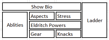
There are 8 boxes – Show Bio, Abilities, Aspects, Stress, Eldritch Powers, Gear, Knacks, and Ladder. There is some overlap – the second picture shows more clearly that Abilities is the height of the middle 3 rows, Ladder is the height of all 4 rows, Eldritch Powers is the width of 2 rows, and there is a gap between each of those rows and columns.
But you can see this is a very simple layout. It represents a 4 x 4 grid, with some of the grid cells made bigger in one direction or another.
Take a moment to look at a sheet you use regularly, and try to break it into sections like this. I’m sure you can do it. Now I’ll show you how easy it is to make a layout like this – I’ll show you two ways, in fact.
The Container and Gaps
Whenever you create a roll20 character sheet, it’s a good idea to place everything inside a container div. This makes a bunch of things easier. You should give this container div a class name – here, I’ve chosen sheet. So, imagine everything is placed inside this div:
<div class="sheet">
   <!-- everything goes here -->
</div>Code language: Haml (haml)
This even makes the CSS easier, since you can create the CSS:
.sheet {
  display:grid;
  grid-template-columns: /* to be decided */ ;
}Code language: CSS (css)
We can see from the picture there are four columns 9with some things spanning more than one column), so we could do something like
.sheet {
  display:grid;
  grid-template-columns: repeat(4, 25%);
}Code language: CSS (css)
That creates the four basic columns. We’d probably want to fine tune the column widths, and add a gap between them. Maybe we’d do something like this (this is, in fact, what I used):
.sheet {
  display:grid;
  grid-template-columns: 200px 200px 210px 150px;
  gap: 5px 5px;
}Code language: CSS (css)
Gap is a special property that sets the gap between row and columns. You can use column-gap and row-gap, but the gap property can set both at the same time. The first number is row gap, the second is column gap.
Now we need to handle those boxes that require special placement and special width.
Grid Item Formatting
Take a moment to look at that picture of the sheet. See how all the grid items have the same colour and rounded borders. You might want to create a unified look. This is easy to do – just create a class which has those properties and assign it to all the grid items.
It’s generally a good idea to at least set a common border during sheet design, so you can easily see what is being created.
.grid-box {
  border: 1pt solid black;
  border-radius: 15px;
  background-color: #dde1c7;
}Code language: CSS (css)
Then I create the following HTML:
<div class="sheet">
    <div class="abilities grid-box">
        Abilities
    </div>
    <div class="bio grid-box">
        Show Bio
    </div>
    <div class="powers grid-box">
        Eldritch Powers
    </div>
    <div class="health grid-box">
        Stress & Health
    </div>
    <div class="aspects grid-box">
        Aspects
    </div>
    <div class="knacks grid-box">
        Knacks
    </div>
    <div class="ladder grid-box">
        Ladder
    </div>
    <div class="gear grid-box">
        Gear
    </div>
</div>Code language: HTML, XML (xml)
The text is just there to show where eveyrthing is. Then we add the total CSS so far.
.grid-box {
border: 1pt solid black;
border-radius: 15px;
background-color: #dde1c7;
}
.sheet {
display:grid;
grid-template-columns: 200px 200px 210px 150px;
gap: 5px 5px;
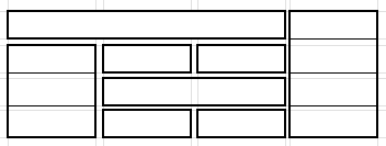
}Code language: CSS (css)and that gives us a sheet that looks like this:
That is definitely not what we want. but now we can use CSS to position everything. Notice how at this point the grid boxes aren’t even in the right order.
Now we update the CSS and add grid addresses for each box
.grid-box {
border: 1pt solid black;
border-radius: 15px;
background-color: #dde1c7;
}
.sheet {
display:grid;
grid-template-columns: 200px 200px 210px 150px;
gap: 5px 5px;
}
.abilities {
grid-column: 1 / 2;
grid-row: 2/ span 3;
}
.bio {
grid-column: 1/4;
grid-row: 1/2;
}
.knacks {
grid-column: 3/4;
grid-row: 4/5;
}
.gear {
grid-column: 2/3;
grid-row: 4/5;
}
.powers {
grid-column: 2/4;
grid-row: 3/4;
}
.health {
grid-column: 3/4;
grid-row: 2/3;
}
.aspects {
grid-column: 2/3;
grid-row: 2/3;
}
.ladder {
grid-column: 4/5;
grid-row: 1 / 5;
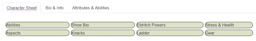
}Code language: CSS (css)That gives us a layout that looks like this:
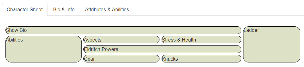
Now we can see the boxes are where we want them to be, and in the order we want. Each grid-item will automatically grow as you enter stuff within it, so while some of those boxes look small now, as they are filled, they will grow to look more like this:
That was a very simple way to plan the layout. But there’s another way, that’s even simpler.
Another Way – Grid Areas
Instead of directly stating grid-row and grid-column addresses, which can be fiddly, we assign each div a grid-area name, and then draw that layout. So instead of something like this:
.abilities {
    grid-column: 1 / 2;
    grid-row: 2/ span 3;
}Code language: CSS (css)
We name that grid area like this:
.abilities {
    grid-area: abilities;
}Code language: CSS (css)
So we would name all 8 boxes like this:
.abilities {
    grid-area: abilities;
}
.bio {
    grid-area: bio;
}
.knacks {
    grid-area: knacks;
}
.gear {
    grid-area: gear;
}
.powers {
    grid-area: powers;
}
.health {
    grid-area: health;
}
.aspects {
    grid-area: aspects;
}
.ladder {
    grid-area: ladder;
}Code language: CSS (css)
Now we use grid-template-areas to draw that map.
.grid-box {
    border: 1pt solid black;
    border-radius: 15px;
    background-color: #dde1c7;
}
.charsheet .sheet {
    display: grid;
    grid-template-areas:
        "bio        bio       bio       ladder"
        "abilities  aspects   health    ladder"
        "abilities  powers    powers    ladder"
        "abilities  trappings knacks    ladder";
    grid-template-columns: 200px 200px 210px 150px;
    gap: 5px 5px;
}Code language: CSS (css)
The way grid-template-areas works is really clever and really simple. Each “row” is enclosed in quotes, and you put the grid-area in the map of the layout. We already know that it’s a 4 x 4 grid, and the first 3 items are the bio, so instead of bothering with grid-row and grid-column, we simply place it 3 times in the map.
This is technically a single line command which could also be written like this:
grid-template-areas: "bio bio bio ladder" "abilities aspects health ladder" "abilities powers powers ladder" "abilities trappings knacks ladder";Code language: CSS (css)But it’s much easier for humans to read it the way it’s written earlier – with one line per row, and added spaces to line up each column, like this:
grid-template-areas:
"bio bio bio ladder"
"abilities aspects health ladder"
"abilities powers powers ladder"
"abilities trappings knacks ladder";Code language: CSS (css)It makes no difference to the computer which you do it, but the last version is a lot easier to read. (The extra spaces aren’t needed, and are just there to line up columns for easier reading.)
In Conclusion
When using CSS Grid, and especially grid-template-areas, it is very easy to design and create the layout of a sheet. But did you know you can nest grids inside each other? In the next post we’ll see how to do that and make even more complex sheets very quickly and easily.