- CSS Grid – Making Columns
- CSS Grid – Grid Cells
- CSS Grid – Creating a Layout
- CSS Grid – Nesting Grids and Multiple Grids
- CSS Grid – Massaging The Grid
- CSS Grid – Display Contents
- CSS Grid – Repeating Sections
- CSS Grid – When Grid Goes Wrong
We have seen how to arrange a sheet using grid, and arrange small grids into tables. The real strange of CSS Grid though is the ability to edo both of these at once – you can nest grids inside grids, and even smaller grids inside those grids. You can have separate grids after each other. It’s bonkers how much versatility there is here, and we’ll touch on that in this post.
CSS Grid is often described as a module added to CSS, but in my opinion, it should be regarded as an integral part of CSS. It is the most important thing you will learn when building a sheet.
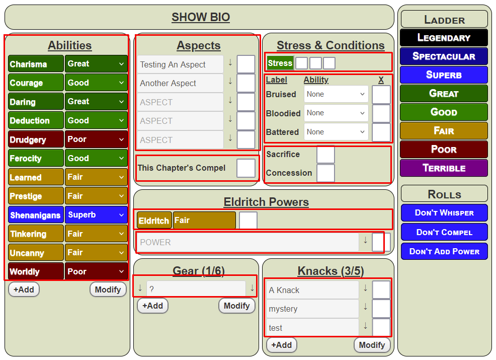
In the last post, I suggested you could use Grid to layout an entire sheet. But you can also lay out sections inside of a sheet. Look at this image. The red areas each show a unique grid, separate from the entire sheet.
There are other ways to achieve the same layout, but CSS Grid is just so easy, and so flexible too.
I’ll show how some of those Grids were created, show them in the context of the whole sheet, and in the next post, describe some special considerations (for example, repeating sections, and When Grid Goes Wrong!).
The Abilities Grid
I’ll describe two methods to do this Grid – which you use is a matter of preference. I prefer the second, but the first is most logical so we’ll start there.
The HTML For Method One
The HTML is mostly immaterial for this example, but it’s handy to see what is being affected. So, it starts like this:
<div class="sheet">
   <div class="abilities">
      <h3>Abilities</h3>
      <div class="abilities-grid">
         <button type="action" name="act_charisma">
             Charisma
         </button>
         <select name="attr_charisma">
             <option>Poor</option>
             <option>Fair</option>
             <option>Good</option>
             <option>Great</option>
             <option>Superb</option>
             <!-- some more options -->
          </select>
         <button type="action" name="act_courage">
             Courage
         </button>
         <select name="attr_courage">
             <option>Poor</option>
             <option>Fair</option>
             <option>Good</option>
             <option>Great</option>
             <option>Superb</option>
             <!-- some more options -->
          </select>
         <button type="action" name="act_daring">
             Daring
         </button>
         <select name="attr_daring">
             <option>Poor</option>
             <option>Fair</option>
             <option>Good</option>
             <option>Great</option>
             <option>Superb</option>
             <!-- some more options -->
          </select>
          <!-- more rows -->
      </div>
   </div>
   <!-- a bunch of other stuff -->
</div>Code language: HTML, XML (xml)
That’s a lot to take in, and most of it is irrelevant to this example, so here’s some pseudo-code to show the relevant parts.
<div class="sheet">
   <div class="abilities">
      <h3>Abilities</h3>
      <div class="abilities-grid">
         <button></button>
         <select></select>
         <button></button>
         <select></select>
         <button></button>
         <select></select>
         <!-- more rows -->
      </div>
   <!-- a bunch of other stuff -->
</div>Code language: HTML, XML (xml)
Here, you can see:
- We have a container
div(sheet) that contains the grid for the whole sheet. - Then one of its
grid-items(“abilities”) itself contains some more HTML. - It contains a heading, followed by another
divthat is a grid. - The items inside that are arranged according to their grid columns.
The CSS For Method One
As always with CSS Grid, this is really simple. First, we have a grid-item that is assigned a name. Then inside that is another div (abilities-grid) which is assigned the full set of properties needed to describe it.
.sheet .abilities {
   grid-area: abilities;
}
.sheet .abilities .abilities-grid {
   display: grid;
   grid-template-columns: 1fr 1fr;
   gap: 1px 5px;
}Code language: CSS (css)
The HTML For Method Two
The above method is fairly straightforward and shows how you can put grids inside grid-items. But you can go further- a grid-item can itself be a new grid. This is true nesting.
We need to modify the HTML a bit. We can dispense with that abilities-grid div, like so.
<div class="sheet">
   <div class="abilities">
      <h3>Abilities</h3>
      <button></button>
      <select></select>
      <button></button>
      <select></select>
      <button></button>
      <select></select>
      <!-- more rows -->
   </div>
   <!-- a bunch of other stuff -->
</div>Code language: HTML, XML (xml)
We are creating a two column width grid, and immediately that heading is going to be a problem – it will take the first space in our grid, throwing off the neat arrangement. But in a recent post, we saw how to make individual elements take up more grid-items, so we can do this:
.sheet .abilities {
   grid-area: abilities;
   display: grid;
   grid-template-columns: 1fr 1fr;
   gap: 1px 5px;
}
.sheet .abilities h3 {
   grid-column: 1 / -1;
}Code language: CSS (css)
We have done two interesting things here. First, we have declared that grid-item is named abilities, but it is also itself a grid. And we have declared that any h3 items inside this grid-item will span the full width of the grid.
We can go further:
.sheet h3 {
   grid-column: 1 / -1;
}Code language: CSS (css)
That way, any h3 element anywhere in the sheet would automatically take up a full row. In this sheet, that works.
Whichever method you choose is fine. Both work.
Aspects, Eldritch Powers, and Knacks
Now look at the picture again. We can see several grid layouts are identical. Aspects, Knacks, and Powers each have a grid that is 3 columns wide: the last 2 columns are the same width, and the first column looks like it is a different width. But…
.sheet .powers,
.sheet .aspects,
.sheet .knacks {
  display: grid;
  grid-template-columns: 1fr 30px 30px;
  gap: 1px 5px;
}Code language: CSS (css)
Here we have a grid layout where the first column has a dynamic width: the two static widths are assigned first, then the remaining width is all assigned to the 1fr (1 fraction). That is exactly what we want.
There are a couple of headings there, but they automatically set to one entire row wide thanks to this earlier rule:
.sheet h3 {
   grid-column: 1 / -1;
}Code language: CSS (css)
We don’t need to see the HTML here – you can see the bulk of the layout work is done in the CSS.
Stress & Conditions – Multiple Grids Following Each Other
Take a look at that Stress & Conditions section. You can see three different CSS Grids have been used, one after the other, each with different numbers of columns. This kind of thing is easy!
What Are Those Blue Boxes?
There are some extra grids, but those Add / Modify boxes show us we are looking at a Repeating Section. They can cause a problem with CSS Grid if you don’t know what you are doing, so we’ll look at them – and some other common gotchas – in the next post.