In last post, I showed one way to do the Abilities section. The HTML looked like this:
<div class="sheet">
    <div class="abilities grid-box">
        <h3>Abilities</h3>
        <button type="action" name="act_charisma">
            Charisma
        </button>
        <select name="attr_charisma">
            <option>Poor</option>
            <option>Fair</option>
            <option>Good</option>
            <option>Great</option>
            <option>Superb</option>
            <!-- some more options -->
        </select>
        <button type="action" name="act_courage">
            Courage
        </button>
        <select name="attr_courage">
            <option>Poor</option>
            <option>Fair</option>
            <option>Good</option>
            <option>Great</option>
            <option>Superb</option>
            <!-- some more options -->
        </select>
        <button type="action" name="act_daring">
            Daring
        </button>
        <select name="attr_daring">
            <option>Poor</option>
            <option>Fair</option>
            <option>Good</option>
            <option>Great</option>
            <option>Superb</option>
            <!-- some more options -->
        </select>
    </div>
    <!-- other stuff -->
</div>Code language: HTML, XML (xml)
And the CSS:
.sheet h3 {
    grid-column: 1 / -1;
}
.abilities {
    grid-area: abilities;
    display: grid;
    grid-template-columns: 1fr 1fr;
    gap: 1px 5px;
}Code language: CSS (css)
Unfortunately, that gives use this image:
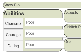
There are a couple of problems here, the selects are too wide for the grid, and the buttons look a bit too tall for the grid rows. These are easily fixed with ordinary CSS jiggling. For example:
.sheet h3 {
    grid-column: 1 / -1;
}
.abilities {
    grid-area: abilities;
    display: grid;
    grid-template-columns: 1fr 1fr;
    gap: 1px 5px;
    padding: 5px;
}
.abilities button {
    height: 24px;
}
.abilities select {
    width: 100%;
    height: 28px;
    margin-bottom: 0;
}Code language: CSS (css)
This adds some CSS specifically to elements within the abilities grid-item, and gives us the following layout:
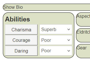
There’s a lot we can (and will) do to change the appearance of these elements, but you can see they now fit nicely within the grid. There are a few things I’d like to draw attention to:
Padding: it’s usually a good idea to add this to a grid-item – this is what creates the spacing between the elements at the edges of the grid-item.
Margin-Bottom: select items always have a large margin-bottom, and you’ll often want to override that to get selects to line up properly with other elements.
Differing Heights: You’d expect that if you assign one height to different elements, they’d be the same height. Sadly this often isn’t the case. You often have to do a little trial-and-error to get elements to line up properly, especially when elements contain other things (buttons contain text that is not part of the button, for instance).
Specificity: Sometimes you need to up the specificity of certain elements to get them to be recognised in the grid. In laymans terms, this just means adding extra valid class-names at the start of each element in CSS, like this:
.ui-dialog .charsheet .sheet h3 {
    grid-column: 1 / -1;
}
.ui-dialog .charsheet .abilities {
    grid-area: abilities;
    display: grid;
    grid-template-columns: 1fr 1fr;
    gap: 1px 5px;
    padding: 5px;
}
.ui-dialog .charsheet .abilities button {
    height: 24px;
}
.ui-dialog .charsheet .abilities select {
    width: 100%;
    height: 28px;
    margin-bottom: 0;
}Code language: CSS (css)
These specific items: .ui-dialog .charsheet are always safe to add to the start of any declarations. You don’t need to include them, or might add them to some elements and not others. They are a handy option to have available.