Display: contents is a very valuable tool for any layout. It’s a little tricky to get your head around, so I’ll first give some gobbledygook, and then show a practical example.
The Gobbledygook: Display: contents moves any HTML inside it up one step in the grid structure. This means contents can be treated as grid-items normally, even though the container they are placed in would normally mess that up. The container vanishes.
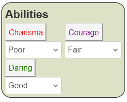
The Practical Example: Let’s look at that abilities section again.
<div class="sheet">
    <div class="abilities grid-box">
        <h3>Abilities</h3>
        <button type="action" name="act_charisma">
            Charisma
        </button>
        <select name="attr_charisma">
            <option>Poor</option>
            <option>Fair</option>
            <option>Good</option>
            <option>Great</option>
            <option>Superb</option>
            <!-- some more options -->
        </select>
        <button type="action" name="act_courage">
            Courage
        </button>
        <select name="attr_courage">
            <option>Poor</option>
            <option>Fair</option>
            <option>Good</option>
            <option>Great</option>
            <option>Superb</option>
            <!-- some more options -->
        </select>
        <button type="action" name="act_daring">
            Daring
        </button>
        <select name="attr_daring">
            <option>Poor</option>
            <option>Fair</option>
            <option>Good</option>
            <option>Great</option>
            <option>Superb</option>
            <!-- some more options -->
        </select>
    </div>
    <!-- other stuff -->
</div>Code language: HTML, XML (xml)
Here we have a 2-column wide grid, like this (with heading removed):
    <div class="abilities grid-box">
        <button>Charisma</button>
        <select name="attr_charisma"></select>
        <button>Courage</button>
        <select name="attr_courage"></select>
        <button>Daring</button>
        <select name="attr_daring"></select>
    </div>Code language: HTML, XML (xml)
Now let’s say we do something to apply a style to an entire row, like making it visible or hidden, or changing its colour, based on the select value. We’d need to add hidden inputs.
    <div class="abilities grid-box">
        <input class="test" name="attr_charisma" value="Poor">
        <button>Charisma</button>
        <select name="attr_charisma"></select>
        <input class="test" name="attr_courage" value="Poor">
        <button>Courage</button>
        <select name="attr_courage"></select>
        <input class="test" name="attr_daring" value="Poor">
        <button>Daring</button>
        <select name="attr_daring"></select>
    </div>Code language: HTML, XML (xml)
So, we want the value of the input to change the colour of the button text (and possibly anything on that row). The column could be wider and hold many elements, not just the two shown here. Wouldn’t it be nice if there was a way to change all those elements at once without changing every item individually? This is where display: contents comes in.
First, we place each row inside a div, and give classes for styling purposes, like this:
    <div class="abilities grid-box">
        <input type="hidden" class="toggle" name="attr_charisma" value="Poor">
        <div class="toggled">
           <button>Charisma</button>
           <select name="attr_charisma"></select>
        </div>
        <input type="hidden" class="toggle" name="attr_courage" value="Poor">
        <div class="toggled">
           <button>Courage</button>
           <select name="attr_courage"></select>
        </div>
        <input type="hidden" class="toggle" name="attr_daring" value="Poor">
        <div class="toggled">
           <button>Daring</button>
           <select name="attr_daring"></select>
        </div>
    </div>Code language: HTML, XML (xml)
Now we have a layout where we can easily change the style of an entire row at a time, maybe with something like this:
.abilities .toggle[value="Poor"] + toggled {
   color: red;
}
.abilities .toggle[value="Fair"] + toggled {
   color: purple;
}
.abilities .toggle[value="Good"] + toggled {
   color: green;
}Code language: CSS (css)
But there is a problem. This looks like this:
This does change the colour of that button text according to our rules, but the ordering of things looks messed up. Let’s put a border around each div to see what’s going on:
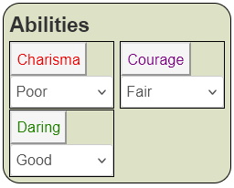
Here we can see each div is still following the grid columns, but has been made a bit taller to accommodate the things inside it. The divs are following the grid, but we want the items inside the div to follow the grid. That’s where display: contents comes in.
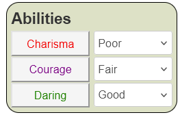
That is exactly what we want. When we change the select value, the text in the button changes colour. We can change the selects too, but they need to be accessed directly (selects are notoriously hard to style), like so:
.abilities .toggle[value="Poor"] + toggled,
.abilities .toggle[value="Poor"] + .toggled select {
   color: red;
}
.abilities .toggle[value="Fair"] + toggled,
.abilities .toggle[value="Fair"] + .toggled select {
   color: purple;
}
.abilities .toggle[value="Good"] + toggled,
.abilities .toggle[value="Good"] + .toggled select {
   color: green;
}Code language: CSS (css)
With that update, the image looks like:

Conclusion
We have applied a style to the entire row, and that row still forms a proper row thanks to display: contents.
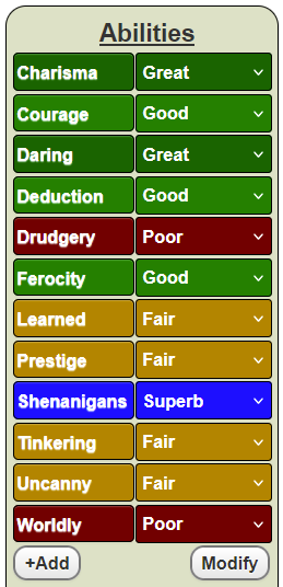
In the actual Carrington Event sheet we do something a little more fancy, but you’ll need to check out the sheet to see how it was done. But this could be done with the technique described above.

There isn’t the littlest trace of any ‘display: contents’ in the CSS you’re showing on this page, which makes me a little confused…
That is worrying! I’ll have to have another look in the coming week and see what I was thinking.
PS: sorry for the late reply. Your comment had been grabbed hungrily by the spam queue and i hadn’t seenit till now.