- Campaign Settings for the Carrington Sheet
- The Sidebar Back of the Carrington Sheet
- The Sidebar Front of the Carrington Sheet
- Rolls and the Rolltemplate in the Carrington Sheet
- Wounds in the Carrington Sheet
- Eldritch Powers in the Carrington Sheet
- A variety of systems in the Carrington Sheet
- Buying an Ability in the Carrington Sheet
- How Many Abilities in the Carrington Sheet
- Managing Experience in the Carrington Sheet
- Adding a Description to the Carrington Sheet
- The Bio Tab in the Carrington Sheet
The sidebar is full of buttons that are of more use to the GM than the players. It is divided into six main sections, three on the ‘front’ and three on the ‘back’.
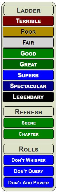
- Ladder: This displays the ranks from Terrible to Legendary, and lets you click on them to roll something at that level. You can use this instead of Abilities when rolling something that isn’t an ability, or there’s a reason to hide what you’re rolling.
- Refresh: When time passes, you recover resources like Stress and Aspects. Clicking these buttons will uncheck a bunch of tings by clicking one button, instead of all of them.
- Rolls: When making a roll, you might want to whisper it to the GM, roll vs a difficulty, or add a power modifier. You can select these here (and they affect only your next roll, being cleared after that roll).
- Fixes: If Warnings are Enabled (see Visuals), you can’t use a lot of stuff without accepting a prompt telling you that once you do it, you can’t undo it. Once you have checked an aspect, it stays checked. But you’ll sometimes make mistakes, and this section lets you reverse most changes.
- Visuals: You can change the way abilities are displayed, or whether warnings are presented. Players can change these freely according to their preference.
- Settings: Some things are set once for all characters, and are left there, like what kind of roll is made, how many aspects players have, what size of bonus is used for certain things. These are all configurable, but once changed they usually stay there.
If you click any heading, it’ll switch between front and back.
We’ll now go through the Sidebar and see how it is designed. While there is a lot on the Sidebar, there are really only 3 techniques used a lot, which means it doesn’t need to be split across many posts.
The Front of the Sidebar
Ladder
This is likely to be the most frequently part of the sidebar. With some colours added, you can see it in the image.
We already have the ranks stored in carrington.json, so we can build those buttons with simple a handlebars block.
<div class="ladder">
   <button type="action" name="act_config"
           class="title"
           title="The list of available ranks.">
      <h3>Ladder</h3>
   </button>
   {{#each ladder}}
   <button type="action"
         name="act_{{downcase this}}-button"
         class="title {{this}}">
      <span>{{this}}</span>
   </button>
   {{/each}}
</div>Code language: Handlebars (handlebars)
Handlebars wont be used a lot in the Sidebar, though it could have been, I was too exhausted and wanted this project over!
As pure HTML, those buttons look more like this:
<button type="action" name="act_terrible-button" class="title Terrible" >
   <span>Terrible</span>
</button>
<button type="action" name="act_poor-button" class="title Poor" >
   <span>Poor</span>
</button>
<button type="action" name="act_fair-button" class="title Fair" >
   <span>Fair</span>
</button>
<!-- and so on -->Code language: HTML, XML (xml)
These buttons will be improved later, but are fully functional now. The sheet worker for rolls created earlier works with these buttons (the benefit of forward planning).
A number of special CSS styles were created for the colouring of these buttons and are used extensively in the sidebar:
.sidebar button.title {
    font-variant: small-caps;
    font-weight: bold;
    margin-top: 3px;
    border-radius: 5px;
    width: calc(100% - 10px);
    height: 24px;
    border: 1pt solid black;
}
.ui-dialog .tab-content .charsheet .Terrible {
    background-color: rgb(119, 0, 0);
    color: white;
}
.ui-dialog .tab-content .charsheet .Poor {
    background-color: rgb(175, 140, 0);
    color: black;
}
.ui-dialog .tab-content .charsheet .Fair {
    background-color: lightgray;
    color: black;
}
.ui-dialog .tab-content .charsheet .Good {
    background-color: green;
    color: white;
}
.ui-dialog .tab-content .charsheet .Great {
    background-color: darkgreen;
    color: white;
}
.ui-dialog .tab-content .charsheet .Superb {
    background-color: blue;
    color: white;
}
.ui-dialog .tab-content .charsheet .Spectacular {
    background-color: darkblue;
    color: white;
}
.ui-dialog .tab-content .charsheet .Legendary {
    background-color: black;
    color: white;
}
Code language: CSS (css)
The initial title class creates a standard style for all the buttons in the sidebar. Then we add a class for each rank, giving it it’s own colour. Doing it this way lets use add the colour to any item just by adding the rank name, and we can change the colours just by editing this bit of CSS.
Refresh and Rolls
These two sections can be used by players when running their characters to control their character.
<div class="rolls">
   <button type="action" name="act_config" class="title"
           title="Change properties of the very next roll.">
      <h3>Rolls</h3>
   </button>

   <input type="hidden" name="attr_whisper" value="0" class="whisper-toggle">
   <button type="action" name="act_whisper" class="title Superb whisper"
           title="Whether to whisper to GM">
      <span>Don't Whisper</span>
   </button>
   <button type="action" name="act_whisper" class="title Good no-whisper"
           title="Whether to whisper to GM">
      <span>Whisper to GM</span>
   </button>

   <input type="hidden" name="attr_query" value="0" class="query-toggle">
   <button type="action" name="act_query" class="title Superb query"
           title="Whether to show Difficulty query">
      <span>Don't Query</span>
   </button>
   <button type="action" name="act_query" class="title Good no-query"
           title="Whether to show Difficulty query">
      <span>Add Query</span>
   </button>

   <input type="hidden" name="attr_power" value="0" class="power-toggle">
   <button type="action" name="act_power" class="title Superb power"
           title="Is a Power Bonus added?">
      <span name="attr_power_label">Don't Add Power</span>
   </button>
   <button type="action" name="act_power" class="title Good no-power"
           title="Is a Power Bonus added?">
      <span name="attr_power_label">Add Power</span>
   </button>
</div>Code language: HTML, XML (xml)
The buttons in the Refreshes and Rolls sections all work exactly the same way: there is a hidden input, and the buttons toggle that value between 1 and 0, according to this sheet worker.
['whisper', 'query', 'power', 'aspect_advances', 'colouring'].forEach(w => {
   on(`clicked:${w}`, () => {
      getAttrs([w], v => {
         setAttrs({
            [w]: 1- int(v[w])
         })
      });
   })
});Code language: JavaScript (javascript)
The colouring and aspect_advances buttons are used by later buttons. The whisper, query, and power inputs are used in the roll worker, described earlier, to decide how a roll should be calculated.
These buttons could easily be added to the part of the tabs routine that handles toggles, replacing the above sheet worker. Everything else would be as described here.
The CSS for these buttons:
.whisper-toggle[value="1"] ~ .whisper,
.whisper-toggle[value="0"] ~ .no-whisper,
.query-toggle[value="1"] ~ .query,
.query-toggle[value="0"] ~ .no-query,
.power-toggle[value="1"] ~ .power,
.power-toggle[value="0"] ~ .no-power,
.power-toggle[value="1"] ~ .power,
.power-toggle[value="0"] ~ .no-power,
.colour-toggle[value="1"] ~ .no-colour,
.colour-toggle[value="0"] ~ .colour,
.aspect-advances-toggle[value="1"] ~ .no-aspect-advance,
.aspect-advances-toggle[value="0"] ~ .aspect-advance {
   display: none;
}
Code language: CSS (css)
This also shows buttons from later in the sidebar. The basic principle is the same for all – the code decides which buttons are hidden – one of each pair is always hidden.
Those Scene and Chapter buttons are also used in more sheet workers. At the end of each Scene, all Stress used should be reset to 0, and at the end of each Chapter (roughly a session), a whole bunch of things should be unchecked. These buttons allow you to just click one button and see those changes happen instantly.
The sheet workers for those could include the specific changes, but instead a master function (time_clear) is created, that handles all the group changes. They supply a parameter, like 0, 1, or 2, and the time-clear function stores changes based on the parameter. By creating it this way, the routine can be called by several workers very simply.
on('clicked:scene', () => {
   time_clear(0);
});

on('clicked:chapter', () => {
   time_clear(2);
});

const time_clear = (time) => {
   // 0= stress, 1= special, 2= chapter, 3= advance, 4= clear all, 5= manifest
   getSectionIDs(`repeating_extras`, ids => {
      getAttrs(['eldritch','eldritch_pool','eldritch_pool_max','character_rank',
            ...seq(5).map(i => `condition${i}_check`)], values => {
         let eldritch = values.eldritch;
         let xp = values.character_rank;
         let eldritch_rank = ranks.indexOf(eldritch) || 1;
         let xp_rank = ranks.indexOf(xp) || 1
         let pool = int(values.eldritch_pool);
         let max = int(values.eldritch_pool_max);
         if (time >= 3) {
            pool = 0;
            max += 1;
         }
         const output = {};
         if (time >= 0) {            //scene
            output.stress = 0;
         }
         if (time >= 1) {     //sacrifice or concession
            seq(11).forEach(i => {
               output[`aspect${i}_check`] = 0;
            });
         }
         if (time >= 2) {     //chapter
            output.sacrifice = 0;
            output.concession = 0;
            ids.forEach(row => {
               output[`repeating_extras_${row}_extra_check`] = 0;
            });
            if(pool < max || time >= 2) {
               seq(7,2).forEach(i => {
                  output[`eldritch_${i}_check`] = 0;
               });
               output.maxed_out = 0;
            } else {
               seq(7,2).forEach(i => {
                  output[`eldritch_${i}_check`] = 0;
               });
               output.maxed_out = 1;
            }
            output.powers_used = 0;

            if (xp_rank > eldritch_rank || time >= 4) {
               output.manifest_allowed = 1;
            } else {
               output.manifest_allowed = 0;
            }
         }
         if (time >= 3) {     //advance
            pool = Math.max(0, pool- 1);
            output.eldritch_pool = pool;
            let not_found = true;
            seq(5).forEach(i => {
               if(not_found && int(values[`condition${i}_check`])) {
                  not_found = false;
                  output[`condition${i}_ability`] = "";
                  output[`condition${i}_check`] = 0;
               }
            });
         }
         if (time >= 4) {     //clear
            output.eldritch_pool = 0;
            seq(5).forEach(i => {
               output[`condition${i}_check`] = 0;
               output[`condition${i}_ability`] = "";
            });
         }
         if (time >= 5) {
            //manifest, increases Eldritch and sets manifest to not allowed
            output.manifest_allowed = 0;
            output.eldritch = ranks[eldritch_rank +1] || 'Poor';
         }
         setAttrs(output);
      });
   });
};    Code language: JavaScript (javascript)
The last sheet worker here is massive, but it handles many different settings. It is basically for removing checkboxes showing that something has been used. There are a lot of them, and at different times in play, you want to clear but lots of them in one fell swoop. This makes that a lot easier.
In The Next Post: The Back of the Sidebar
The back of the sidebar includes a lot of interesting techniques. White it’s a small part of the sheet, it deserves its own post.