- Campaign Settings for the Carrington Sheet
- The Sidebar Back of the Carrington Sheet
- The Sidebar Front of the Carrington Sheet
- Rolls and the Rolltemplate in the Carrington Sheet
- Wounds in the Carrington Sheet
- Eldritch Powers in the Carrington Sheet
- A variety of systems in the Carrington Sheet
- Buying an Ability in the Carrington Sheet
- How Many Abilities in the Carrington Sheet
- Managing Experience in the Carrington Sheet
- Adding a Description to the Carrington Sheet
- The Bio Tab in the Carrington Sheet
Every character sheet needs a section for information about the character – their background, height, weight, that kind of thing. But this information is often redundant – you and the other players know it already, so you don’t need to see it all the time. The Carrington sheet uses tabs to switch between a visible Bio section, and another section reduced to nothing more than the title, so you can show it when needed and hide it when it would be redundant.
Table of Contents
Creating the Bio Frame
We know we want to switch between a populate Bio and a hidden Bio, so we first create the divs for this these:
<input type="hidden" class="biotoggle" name="attr_biotoggle" value="1" />
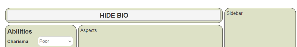
<div class="bio grid-box shrunk">
<button type="action" name="act_biotoggle">
<h3>SHOW BIO</h3>
</button>
</div>
<div class="bio grid-box expanded">
<button type="action" name="act_biotoggle">
<h3>HIDE BIO</h3>
</button>
</div>Code language: HTML, XML (xml)We create two divs of class bio, intending to toggle which of them is visible using the Universal Tabs method. As described in an earlier post, the class bio sets the position in the grid, while grid-box sets the formatting of the section. shrunk and expanded are added because we need a way to distinguish between the two divs.
The headers are just to allow us to see which div is visible right now. We’ll need some CSS to see what this looks like.
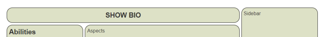
div.bio.expanded,
div.bio.shrunk {
    display: none;
}

.biotoggle[value="1"] ~ div.bio.expanded,
.biotoggle[value="0"] ~ div.bio.shrunk {
    display: grid;
    align-content: start;
}Code language: CSS (css)
This code makes sure the default for each div is hidden, then shows only one based on the value of the input with class biotoggle. That looks like this:
That looks pretty awful. We need to add some styling to make the button more presentable. First, we add a new title class to the button, so we can target it with CSS.
<button type="action" name="act_biotoggle" class="title"> Code language: HTML, XML (xml)For styling, we just want to get rid of that grey box. This will do:
.charsheet button.title {
    border: 0;
    background: transparent;
}Code language: CSS (css)
We get rid of the border and make the button transparent. This now looks like:
That’s much better. Now we just need to add the sheet worker code to allow the switching between the two divs.
The code below is way more complicated than it needs to be, but is using the code presented for Universal Tabs in an earlier post, and that const tabs variable at the start will be expanded on later for easy addition of more tab-like structures.
    const tabs = {
        toggles: ['biotoggle'],
        inserts: {
            /* action buttons which insert the name in a specific location */
        }
    };
    /* === TAB CODE: DO NOT ALTER === */
    const events_for_tabs = (stats, clicks = 0, open = 0, section = '') =>
        stats.reduce((all, one) =>
            `${all} ${clicks ? 'clicked' : 'change'}:` +
            `${one}`, `${open ? 'sheet:opened ' : ''}`);
    const tab_inserts = Object.keys(tabs.inserts).reduce((all, one) =>
               [...all, ...tabs.inserts[one] ], []);
    const tab_events = `${events_for_tabs(tabs.toggles, 1)} ${events_for_tabs(tab_inserts, 1)}`;
    const tab_stats = [...tabs.toggles, ...Object.keys(tabs.inserts)];
    on(tab_events, eventInfo => {
        getAttrs(tab_stats, values => {
            const trigger_full = eventInfo.triggerName.split(":");
            const trigger = trigger_full[1];
            output = {};
            if(tabs.toggles.includes(trigger)) {
                output[trigger] = 1 - (+values[trigger] || 0);
            } else if(tab_inserts.includes(trigger)) {
                Object.keys(tabs.inserts).forEach(insert => {
                    if(tabs.inserts[insert].includes(trigger)) {
                        const destination = insert;
                        output[destination] = trigger;
                    }
                });
            }
            if(Object.keys(output)) setAttrs(output);
        });
    });
    /* === TAB CODE END === */Code language: JavaScript (javascript)
The only part of this monstrosity you need concern yourself with is the tabs variable at the start – notice biotoggle has been added there.
With that function sorted, we can move on to filling out the contents of the Bio section.
Filling Out The Bio
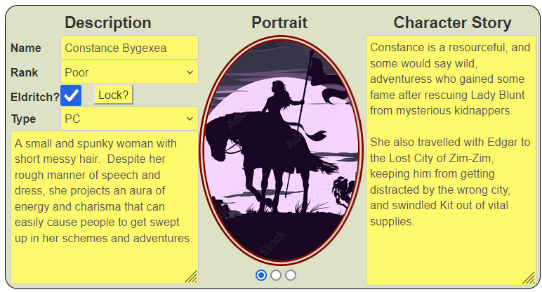
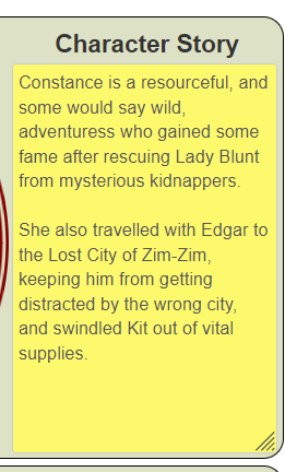
There is a lot of information to fit in here, so we create 3 divs: the left will contain name and basic descriptive information, the middle div will contain the portrait, and the right div will contain a background story. That will eventually look like this (don’t worry about the colours – they are placeholders):
The three divs look are placed in yet another grid. Here’s the beginning HTML and CSS.
    <div class="description">

    </div>
    <div class="portrait">

    </div>
    <div class="story">

    </div>Code language: HTML, XML (xml)
.charsheet div.bio {
grid-template-columns: auto auto auto;
column-gap: 5px;
}Code language: CSS (css)This may get display: grid or display: none from earlier CSS. Here we place the code for when it is visible. The grid column widths will be changed later.
Story
We are describing these columns from right to left, to handle them simplest to most complicated.
We only want a heading and a big text box (a textarea) here. That should be simple. But by default, it looks like the first picture below. We want it to look more like the second picture (we’ll be able to easily change the colours later – for now, we just want the ability to set a colour).
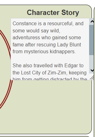
The drawbacks: a standard textarea overlaps the middle column, wraps over the right edge, is too short, and has a glaring white background. This is where the styling of CSS comes into it. We could apply the styling all to the textarea.story, as shown below.
.charsheet textarea.story {
    height: calc(100% - 37px);

    margin-left: 10px;

    width: 185px;

    background-color: #FFF977;

    margin-bottom: 0;
}Code language: CSS (css)
The height here uses calc(). We want it to be as close to 100% as possible, but need to account for that heading. Calc() allows us to account for the size of other elements.
One thing to be aware of here is there must be a space either side of the operator (the minus sign here).
The other elements make sure it fits in the designated area.
A better approach is to split that box into other declarations, which we can use for more elements, like this:
.charsheet textarea,
.charsheet input,
.charsheet select,
.charsheet button[type="action"] {
    background-color: #FFF977;
}
.charsheet textarea {
    grid-column: 1 / -1;
    margin-bottom: 0;
}
.charsheet div.bio textarea.story {
    height: calc(100% - 37px);
    margin-left: 10px;
    width: 185px;
}Code language: CSS (css)
The background-color declaration blocks allow us to create a common background colour for all elements, and if we want to change that colour later (we will), we can change them in one place.
Then we set some common properties for textareas. The bottom margin for textareas is kind of ridiculous, and here we set a textarea to always fill a grid. We can override this for specific taxtareas if we want to, but we know they will all have these properties if we do nothing.
Finally, we set the required properties for this specific textarea.
This shows even the simplest areas in a character sheet can sometimes take more code and time than we’d like.
Portrait
We want a place to show the character portrait if chosen. A relatively recent addition to character sheet allows for this, as demonstrated in the Castle Falkenstein Sheet, on page 3.
We’ll use that method, altered to fit this sheet. The HTML looks like this.
<div class="portrait">
   <button type="action" name="act_biotoggle" class="title">
      <h3>Portrait</h3>
   </button>
   <input type="hidden" name="attr_image_type" value="cover" class="radio-image">
   <img name="attr_character_avatar">
   <div class="image-type" title="Click to change image scaling">
      <input type="radio" name="attr_image_type" value="cover" title="cover" checked id="cover">
      <input type="radio" name="attr_image_type" value="contain" title="contain" id="contain">
      <input type="radio" name="attr_image_type" value="fill" title="fill" id="fill">
   </div>
</div>Code language: HTML, XML (xml)
The attr_character_avatar automatically displays the image assigned to the sheet’s bio tab, and we we want to use that for the portrait. Notice, we add a radio button below the image – this is because there are several ways to make an image fit into an assigned size and we are giving players the power to adjust that.
We put the radio button inside a div so we can use the title tag to easily display instructions. A title tag shows text when an element is hovered over, and once that div is made 100% the width, it’ll be a lot wider than the radio button so there’ll be places where those instructions show up.
The hidden image_type input is used to hold the current value of the radio button (cover, contain, or fill), and the CSS will use that value to set the style of the portrait.
Now on to the CSS and the final appearance.
.charsheet div.bio .portrait img {
    border: 5pt double darkred;
    border-radius: 50%;
    height: 250px;
    width: 175px;
    object-fit: cover;
}
.charsheet div.bio div.image-type {
    text-align: center;
    width: 100%;
}
.charsheet div.bio .portrait input.radio-image[value=contain] ~ img {
    object-fit: contain;
}
.charsheet div.bio .portrait input.radio-image[value=fill] ~ img {
    object-fit: fill;Code language: CSS (css)
We start with the code for the portrait box. We need to set a height and width to use the object-fit property, and giving it a huge border-radius creates the style of portraits used in the Victorian Age.
Taller portraits than wide ones look best, but here is what one portrait could look like in all three types:
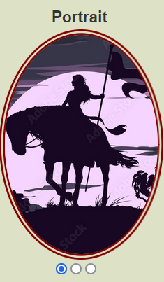
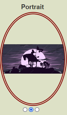
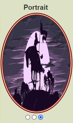
For this image, the first option looks best, but it really does vary with the image.
Description and Wrapping Up
The Description section is small but contains a lot of complexity. We’ll cover that in the next post, and show the full code for this section of the character sheet.