- Campaign Settings for the Carrington Sheet
- The Sidebar Back of the Carrington Sheet
- The Sidebar Front of the Carrington Sheet
- Rolls and the Rolltemplate in the Carrington Sheet
- Wounds in the Carrington Sheet
- Eldritch Powers in the Carrington Sheet
- A variety of systems in the Carrington Sheet
- Buying an Ability in the Carrington Sheet
- How Many Abilities in the Carrington Sheet
- Managing Experience in the Carrington Sheet
- Adding a Description to the Carrington Sheet
- The Bio Tab in the Carrington Sheet
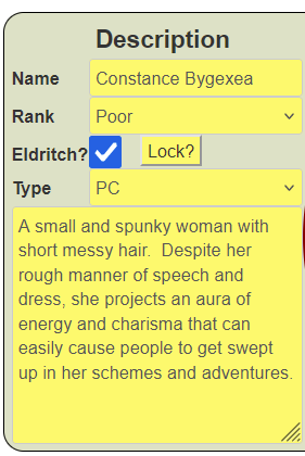
This is most complex of the three columns with many parts. Let’s look at what we want it to look like (and as usual ignore the colours).
We can see there is a label, followed by a table with two columns and 4 rows, then a textbox. We can easily do the table layout using CSS Grid, yet again, and the default textbox will automatically span both columns. So, we need to figure out the height of the textarea, and look at the table part.
You can select a name, rank, whether the character is Eldritch (all PCs are), and whether the character is a PC or an NPC. The Lock button then locks these options in so you can’t accidentally change them. This is done using a combination of a sheet worker and CSS.
The HTML is below, and there is a lot going on here to discuss. We’ll break it down and look at each part.
<div class="description">
    <button type="action" name="act_biotoggle" class="title">
       <h3>Description</h3>
    </button>
    <input type="hidden" name="attr_lock" class="lock-toggle" value="0">

    <span class="title">Name</span>
    <input type="text" name="attr_character_name" class="fit locked" value="" readonly>
    <input type="text" name="attr_character_name" class="fit unlocked" value="">
    <span class="title">Rank</span>
    <select name="attr_character_rank" class="fit unlocked">
       {{#each ladder}}
       {{#unless @first}}<option {{#eq this "Poor"}}selected{{/eq}}>{{this}}</option>{{/unless}}
       {{/each}}
    </select>
    <input type="text" name="attr_character_rank" value="Poor" class="locked fit" readonly />
    <span class="title">Eldritch?</span>
    <div>
       <input type="checkbox" name="attr_eldritch_exists" class="eldritch-on unlocked" value="1" checked>
       <input type="checkbox" name="attr_eldritch_exists" class="eldritch-on locked noclick" value="1" checked>
       <button type="action" name="act_lock" class="nod20">
          <span name="attr_lock_label">Lock?</span>
       </button>
    </div>

    <span class="title">Type</span>
    <div class="type">
       <select name="attr_character_type" class="fit unlocked" value="PC">
          <option selected>PC</option>
          <option>Prime</option>
          <option>Extra</option>
       </select>
       <input type="text" name="attr_character_type" class="fit locked noclick" value="PC" readonly>
       <input type="text" name="attr_character_label" class="fit locked noclick" value="PC" readonly>
    </div>
    <textarea name="attr_description" class="description" placeholder="DESCRIPTION"></textarea>
</div>Code language: Handlebars (handlebars)
Yet Another Grid
Part of the section is a two-column section, so it is no-brainer to use CSS Grid. It makes creating pseudo-tables very easy, and allows for things to fill multiple columns easy too (as in the header at the top and textarea at the bottom.
.charsheet div.bio .description {
    display: grid;
    grid-template-columns: 4em auto;
    column-gap: 5px;
    align-content: start;
}Code language: C/AL (cal)
.charsheet div.bio .description .fit {
width: 160px;
height: 28px;
margin-bottom: 0;
}Code language: CSS (css)The grid section has the addition of align-content: start. Normally, a grid will divide its rows to fit its container, but that creates an unsightly spread. Aligning the rows to the start squeezes them all into the minim space possible.
The fit class we have created here is so that we can assign common values to inputs and selects – just add that class and these values will be automatically added. This ensures that the width (among other things) of text boxes doesn’t spread into the middle column.
Using Span for Labels
It’s common to use Label element for, well, labels, but I don’t like using it. It was designed for use with forms which aren’t allowed in roll20, and the styling is different from other text. I prefer using spans for all text. I created a common class, title, allowing us to assign common styles.
Note: I was going to use the class label, but Roll20 is already using that. Sometimes there are predefined classes and it’s a good idea to avoid them – they may have CSS styling in them you aren’t expecting.
.charsheet span.title {
    font-weight: bold;
    margin-top: 5px;
}Code language: CSS (css)
Here we make labels bold, and spans are not very well aligned with inputs and selects. Giving them a top margin of 5px usually lines them up nicely.
The Locked Button
Much of the function of this section differs when locked and when unlocked. Since there are just two states, it’s easy to create a hidden input which toggles between values of 0 and 1.
We already have a sheet worker that handles toggling (biotoggle), so can just add lock to that. We want the label on the action button to change from Locked to Lock? based on the status of the lock attribute, soo another brief sheet worker is created for that. We already have the lock and lock_label attributes, now we need to fill them. We already have the foundation for most of this.
    on('change:lock sheet:opened', () => {
        getAttrs(['lock'], values => {
            const lock = +values.lock || 0;
            const lock_label = lock ? "Locked" : "Lock?";
            setAttrs({lock_label});
        });
    });
    const tabs = {
        toggles: ['biotoggle', 'lock'],
        inserts: {
            /* action buttons which insert the name in a specific location */
        }
    };
    run_tabs(tabs);Code language: JavaScript (javascript)
Doubling Up On Elements
If you want elements to exist in two states, you often need two separate copies of those elements and use CSS to hide one and display the other. There’s a lot going on here. First, we have a character_name input whose name can be changed when unlocked, but is fixed when locked. There is also a character_rank and character_type, both of which have different mechanical rules. They are presented as select dropdowns when unlocked, and readonly inputs when locked.
Finally there is an Eldritch checkbox, whose value can be changed when unlocked, but can’t be altered when locked. This effect is created by adding the CSS pointer-events: none; when locked. This refers to the mouse, and means you can’t click the checkbox and thus cant accidentally change it by clicking it. By creating a noclick class, we can add this to any relevant item which might be handy later.
.charsheet select.noclick,
.charsheet input.noclick {
    pointer-events: none;
}
.charsheet div.bio input.lock-toggle:not([value="1"]) ~ div .locked,
.charsheet div.bio input.lock-toggle:not([value="0"]) ~ div .unlocked,
.charsheet div.bio input.lock-toggle:not([value="1"]) ~ .locked,
.charsheet div.bio input.lock-toggle:not([value="0"]) ~ .unlocked {
    display: none;
}Code language: CSS (css)
There are different locked and unlocked items here, because they are based on the class of a specific input, and you have to trace the path to the things its class affects. Some items are in the same container, and some are inside a div inside that container.
Character Name
All character sheets in all systems have a special character_name attribute. If you change that, the visible name of the character sheet changes, so it’s a good idea to include it somewhere on the sheet. Players can enter the name of their character in one place, and it becomes the name of their character sheet. It’s very handy.
Character Rank Unless
Characters have an advancement rank which matches values on the ladder, but cannot equal terrible. So, we can use the Handlebars each list to build it. This is what that looks like with some extra nesting.
<select name="attr_character_rank" class="fit unlocked">
   {{#each ladder}}
      {{#unless @first}}
         <option {{#eq this "Poor"}}selected{{/eq}}>{{this}}</option>
      {{/unless}}
   {{/each}}
</select>Code language: Handlebars (handlebars)
The unless statement here says, unless this is the first item create the option. Since Terrible is the first option, that never gets an item, so we have a dropdown that starts at Poor, which is exactly what we want.
The eq part ensures that Poor gets the selected keyword, so that is the default value, just as with Abilities.
In Conclusion
Sp there we have it, the finisghed Bio section. But there’s a lot of the sheet left to do…