This is the start of series showing how you might build a sheet from the ground up, by watching me build a sheet from the ground up!
I am planning a game called The Carrington Event, which uses its own rules that are possibly inpired by Fudge or fate, with a dash of The Apocalypse Engine, while the setting is a mashup of the steampunk genre (especially the optimistic pulp setting of Castle Falkenstein) combined with the age of classic gothic horror (from the 1800s up to the Hammer Horror era). I need a system to play it in. That’s where the sheet comes in.
Each post in the series will show how a different section of is created, and each one will have novel ways to do things. If you have read all the posts in the Sheet Author Guide, there’ll still be new things here.
Planning a Sheet
It’s a good idea to imagine what the final sheet will look like. I’m aiming for something like this (it won’t be exactly like this – this was an earlier version):
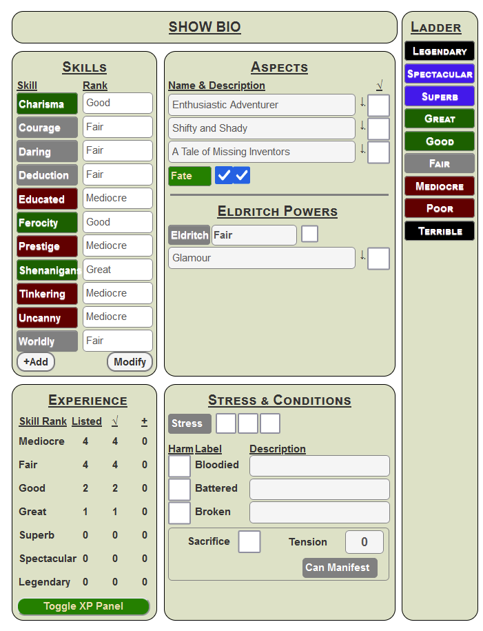
There’s a bunch of things going on here that will be explained in due time. It’s a tall, narrow sheet, but several sections are designed to be hidden to make it easier to view. More of that in due time. It’s narrower than you realise, so you don’t take up vast amounts of space on the battlemap when you look at it. We’ll see that all the rolls can be made without having the sheet opened but some of the record-keeping (like marking injuries) needs access to the sheet.
Using CSS Grid
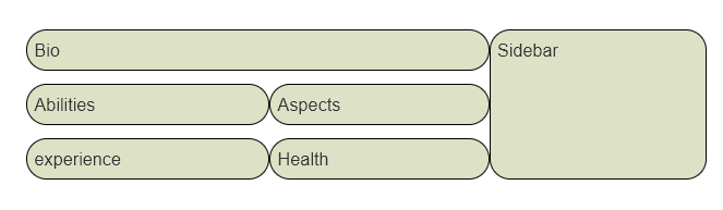
Here we are using CSS Grid for the layout. This is perfect when you have a layout that can be divided into “blocks” of content. Notice that the Bio(graphy) section is two columns wide, and the sidebar is thin and is as high as the whole chaacter sheet. Here’s how you might arrange that in CSS.
div.container {
    display: grid;
    column-gap: 5px;
    grid-template-areas:
        "bio        bio       sidebar"
        "abilities  aspects   sidebar"
        "experience health    sidebar"
        ;
}
div.container .bio
    grid-area: bio;
}
div.container .sidebar {
    grid-area: sidebar;
}
div.container .abilities {
    grid-area: abilities;
}
div.container .aspects {
    grid-area: aspects;
}
div.container .health {
    grid-area: health;
}
div.container .experience {
    grid-area: experience;
}
.charsheet div.grid-box {
    border: 1pt solid black;
    border-radius: 15px;
    background-color: #dde1c7;
    padding: 5px;
    margin-bottom: 5px;
}Code language: CSS (css)
This creates a layout of blocks like this:
Some rudimentary CSS is added to make the grid-areas stand out – borders, background, etc. in the grid-box class.
The HTML for this is:
<div class="container">
    <div class="bio grid-box">
        Bio
    </div>
    <div class="abilities grid-box">
        Abilities
    </div>
    <div class="aspects grid-box">
        Aspects
    </div>
    <div class="health grid-box">
        Health
    </div>
    <div class="sidebar grid-box">
        Sidebar
    </div>
    <div class="experience grid-box">
        experience
    </div>
</div>Code language: HTML, XML (xml)
Notice how each HTML block is given a grid-area in CSS. This is the name that the CSS uses to identify it. Then in the container, with have grid-template-areas, which shows the layout of each block. We can see here that bio takes up two columns of width, and sidebar takes up 3 of height, because they are listed that way in grid-template-areas.
Look at the HTML. Each block has a single word like Health or Sidebar. This is just for the design phase, where we can look at the way the blocks are arranged, and make sure they are laid out properly. They’ll be removed later (or maybe made headings).
There are other ways to achieve that layout, but this is a very simple way to do it.
Note: I’ll probably change some specifics of the grid-box class later – this just gets us started.