Here we are continuing the construction of a new seet for the new game, The Carrington Event. In this post, we’ll build a list of abilities, show them on the character sheet, and show how easy it is to substute a different list of abilities.
We start with very barren HTML and CSS sections that looks like this:
<div class="abilities grid-box">
   Abilities
</div>Code language: HTML, XML (xml)div.container .abilities {
grid-area: abilities;
}Code language: CSS (css)The Game System
Before we get started, we need to know how the system works. This game system uses a predefined list of Abilities, like Charm, Fighting, and Uncanny. These abilities together cover everything you can do, and say a lot about what kind of person you are. Each ability is not rated numerically, but is given an adjective that describes how good you are at it, like Poor, Good, or Superb. The sheet needs to show them all, and let players select which rank they have.
The method used in this sheet can easily be used to build a sheet that uses more traditional numerical ratings – this is a guide!
The JSON File
Since the sheet is being built with the Handlebars tool, we need a JSON file. I created a file called carrington.json, and added the abilities and ranks, like so:
{
    "ladder": ["Terrible", "Poor", "Fair", "Good", "Great", "Superb", "Spectacular", "Legendary"],
    "abilities": ["Charisma", "Courage", "Daring", "Deduction", "Drudgery", "Educated", "Ferocity", "Prestige", "Shenanigans", "Tinkering", "Uncanny", "Worldly"]
}Code language: JSON / JSON with Comments (json)
Here we can see the names of the Ranks, in ladder, and the names of the Abilities. Each is an array. We’ll see how they are used to build the sheet shortly.
The Grid
Since we want a list of abilities with the rank for each ability, that only needs a simple grid layout with just two columns. So we can create this CSS:
div.container .abilities .ability {
    display: grid;
    grid-template-columns: 80px 100px;
    column-gap: 5px;
}Code language: CSS (css)
It’s going inside the abilities box, and we’ll create a separate box for each ability inside that. Exactly why we do that isn’t apparent yet, but it will make some things easier later. We create a class for that ability box.
The List of Abilities
Using handlebars, creating the list of Abilities is simple. (The raw HTML version is below.)
<div class="abilities grid-box">
    <h3>Abilities</h3>
    {{#each abilities}}
    <div class="ability">
       <span>{{this}}</span>
    </div>
</div>Code language: Handlebars (handlebars)
Using the each keyword, this loops through every name in the abilities array, and creates a span for it. That looks like this (we’ve made the text bold using CSS, and made the word Abilities a heading):
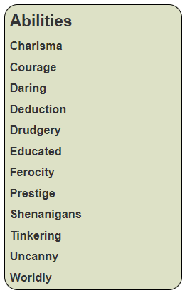
See how the entire list of ability names has been created with just a few simple lines of code. If we change the abilities in the carrington.json file, the list shown here will change.
Adding the Ranks
Now, we want to add a drop down for the ranks. We can see there is a list of ranks, so we’d like to loop through them the same way we did with Abilities. But the point in the code we want to add it is inside an each already (for each ability, add the list in ladder). We need a special trick here.
<div class="abilities grid-box">
    <h3>Abilities</h3>
    {{#each abilities}}
    <div class="ability">
       <span>{{this}}</span>
       <select name="attr_{{downcase this}}">
       {{#each @root.ladder}}
           <option>{{this}}</option>
       {{/each}}
       </select>
    </div>
</div>Code language: Handlebars (handlebars)
By using @root, we take the each list back from the top level even though we are already inside another each list. That now looks like this:
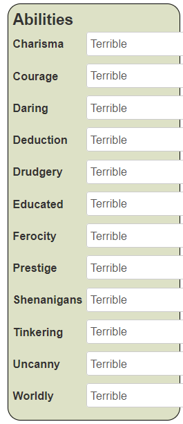
There are two problems here. First, the width of the select extends wider than the box containing it, and there is an unsightly margin between each select. Let’s add some CSS.
div.container .abilities .ability select {
width: 100px;
margin-bottom: 2px;
border-radius: 10px;
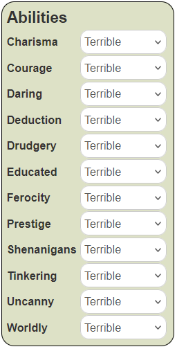
}Code language: CSS (css)The declaration line tells us (going from right to left) to target any selects, inside the class ability, which are inside the class abilities, which are inside a div with the class container. This ensures we very precisely get only these select elements. We fix the width, drop the margin from 0 px to 2px (we could eliminate it entirely), and add some nice rounding to the corners of the border. The result looks like this:
In Roll20, when you first create a select, it looks like something is selected, because it defaults to showing the first item in the select’s option list. But nothing is actually selected – it is undefined. This can easily confuse people who try to use that rating and discover it doesn’t have the value they expect it to. So, we want to make sure each ability there does have a value. You can do that with the selected keyword.
Fixing the Selects
It would be handy to set the default value to Poor, since that’s what players actually have. We can do that with the eq helper, like so:
{{#each @root.ladder}}
<option {{#eq this "Poor"}}selected{{/eq}}>{{this}}</option>
{{/each}}
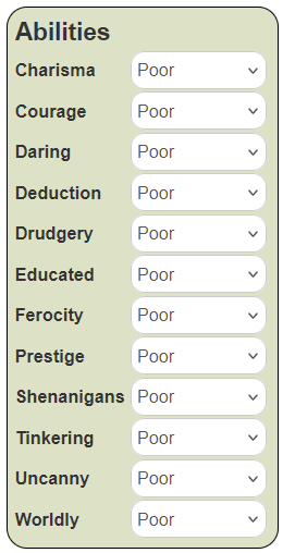
Code language: Handlebars (handlebars)Now when adding each option, handlebars checks if the new value equals Poor, and if so, adds the selected keyword.
The new list looks like this:
And just to make sure it’s working properly, we click a dropdown to see what the select options actually are. The contents of a dropdown looks like this:
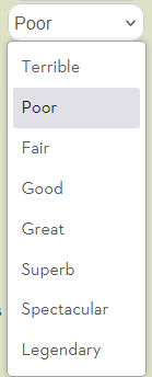
We can see that Poor is selected. Perfect.
That is much prettier, and much closer to what we want. But there is still a problem. But first…
For reference, we could easily change the list of abilities and the ladder of ranks just by changing the carrington.json values, like so:
{
    "ladder": ["Terrible", "Mediocre", "Poor", "Fair", "Good", "Great", "Superb", "Amazing", "Legendary"],
    "abilities": ["Strength", "Dexterity", "Constitution", "Intelligence", "Wisdom", "Charisma"]
}Code language: Handlebars (handlebars)
Then, just using the handlebars tool and click the Generate button. A new HTML file is instantly created with the new set of abilities and their possible ranks. As shown above, their names and how many of them there are can be changed completely. You could repeat the same technique several times in a sheet, creating sections for Stats, Skills, Saving Throws and more, so much more rapidly.
The entire code to generate this list of dropdowns is
<div class="abilities grid-box">
    <h3>Abilities</h3>
    {{#each abilities}}
    <div class="ability">
       <span>{{this}}</span>
       <select name="attr_{{downcase this}}">
       {{#each @root.ladder}}
           <option {{#eq this "Poor"}}selected{{/eq}}>{{this}}</option>
       {{/each}}
       </select>
    </div>
</div>Code language: Handlebars (handlebars)div.container .abilities .ability {
display: grid;
grid-template-columns: 80px 100px;
column-gap: 5px;
}
div.container .abilities .ability select {
width: 100px;
margin-bottom: 2px;
border-radius: 10px;
}
div.container .abilities .ability span {
margin-top: 5px;
font-weight: bold;
}Code language: CSS (css)There’s a little bit of extra CSS added to the span, to line it up properly and make it bold.
The Raw HTML Block
I’ve used Handlebars to build this section of the character sheet, but it can be done with raw HTML. Here’s what that would look like:
    <div class="ability">
            <span>Charisma</span>
            <select name="attr_charisma">
                <option >Terrible</option>
                <option selected>Poor</option>
                <option >Fair</option>
                <option >Good</option>
                <option >Great</option>
                <option >Superb</option>
                <option >Spectacular</option>
                <option >Legendary</option>
            </select>
        </div>
        <div class="ability">
            <span>Courage</span>
            <select name="attr_courage">
                <option >Terrible</option>
                <option selected>Poor</option>
                <option >Fair</option>
                <option >Good</option>
                <option >Great</option>
                <option >Superb</option>
                <option >Spectacular</option>
                <option >Legendary</option>
            </select>
        </div>Code language: HTML, XML (xml)
And so on for all twelve abilities. You can see why I used Handlebars.
Still To Do
There’s more to add to this section, like handling how rolls are made (moving the spans containing the ability names into buttons), and a repeating section for adding new abilities not included in the list. But we can add them later. For now we can be happy this Abilities list is laid out properly and looks decent.