Conditional Inputs are like a specific kind of select element.
Maybe you want a toggle, to show something is on or off, like whether a suit of armour is worn or not. A checkbox is a great way to handle that.
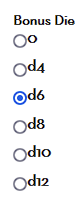
Or maybe you want to present a small list and have all options shown on screen at the same time. Like you can get a bonus die of nothing, d4, d6, d8, d10, or d12 – you might use a radio button to show which is currently the case.
Labels are a way of displaying text, that have a special connection to checkboxes and radio buttons.
Checkboxes and Radio Buttons
Checkboxes are created exactly like Inputs, with type=”checkbox”. Their value works differently. The value of a checkbox is the value it takes when checked. When not checked, the value is always zero.
This is important. Sometimes people create something like this:
<input type="checkbox" name="attr_nope" value="0">Code language: HTML, XML (xml)Don’t ever do this. The value when checked is exactly the same as when unchecked, so this checkbox never does anything.
It’s not uncommon to use an attribute or part of a roll as the value. For example:
<input type="text" name="attr_roll" value="@{strength} + @{bonus}" disabled>
<input type="checkbox" name="attr_double_strength" value="@{strength}">Code language: HTML, XML (xml)
Think about what happens here. The first line is an autocalc which is normally equal to Strength score. If the checkbox is not checked, it equals zero, so the bonus is zero. If checked, though, the bonus equals Strength score, so that strength is effectively doubled.
There are lots of ways to use a checkbox – they become much more powerful in later chapters, with both CSS and Sheet Workers.
Checked By Default
If you want the checkbox to be checked automatically, and the user needs to uncheck them when it’s not active, just add the checked property:
<input type="checkbox" name="attr_double_strength" value="@{strength}" checked>Code language: HTML, XML (xml)Value-less CheckBoxes
You technically don’t need to include the value, especially if the checkbox is just a visual aid and the value is never actually used. This is perfectly valid:
<input type="checkbox" name="attr_example">Code language: HTML, XML (xml)When checked, this checkbox has a value of “On”. So it’s generally better to give a value, just in case its needed. Personally, I always set checkboxes to a value of 1, unless there’s a reason to set it to something else. Then it always has a value of “0” or “1”, which is handy to serve as toggle.
<input type="checkbox" name="attr_example" value="1">Code language: HTML, XML (xml)Radio Groups
<input type="radio" name="attr_wound_status" value="Healthy" checked>
<input type="radio" name="attr_wound_status" value="Bruised">
<input type="radio" name="attr_wound_status" value="Bloody">
<input type="radio" name="attr_wound_status" value="Battered">
<input type="radio" name="attr_wound_status" value="Unconscious">Code language: HTML, XML (xml)
Radios are great for presenting multiple choices when you want all options to be visible. You might use it for wound or encumbrance status for example.
Create a separate input for each possible value, but give them all the type radio, and the same name. As with a checkbox, you can use checked to set the default value.
Radios and Containers
It’s best to keep radio groups in the same container. But radio groups are set by their attribute name, so it’s possible to have radio inputs scattered across the sheet. There is a problem if you have radio inputs of the same name in different radio groups:
<div>
    <input type="radio" name="attr_count" value="0">
    <input type="radio" name="attr_count" value="1">
    <input type="radio" name="attr_count" value="2" >
</div>
<div>
    <input type="radio" name="attr_count" value="2">
    <input type="radio" name="attr_count" value="3">
    <input type="radio" name="attr_count" value="4" >
</div>Code language: HTML, XML (xml)
Imagine you have two groups like this – they might not be next to each other. All will be fine, as long you don’t click the button with a value of 2. Only one of them will be visibly shown, and it might be the one you just clicked. In the picture to the right, I just clicked the 2 on the top row (the right must circle), and the bottom left circle is selected.
This won’t come up very often, but it’s here just in case you need to know.
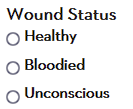
LABEL
The last screenshot shows two rows of three circles, one for each radio button. That’s not very useful – it’s handy to label each button. There are two ways to use the label element. The first is just a container.
<div>
    <h3>Wound Status</h3>
    <label>
        <input type="radio" name="attr_wound_status" value="0">
        <span>Healthy</span>
    </label>
    <label>
        <input type="radio" name="attr_wound_status" value="1">
        <span>Bloodied</span>
    </label>
    <label>
        <input type="radio" name="attr_wound_status" value="2">
        <span>Unconscious</span>
    </label>
</div>Code language: HTML, XML (xml)
There are a couple of things going on here. Labels are acting as containers. The actual labelled text is placed inside a span – it’s always a good idea to avoid naked text. By putting the text in its own HTML Element (in this case a span), you can manipulate that text directly with CSS later.
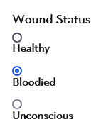
The inputs are given numeric values. You can then use them in rolls. In this example, the attacker suffers a -2 penalty when bloodied:
/roll 1d20+@{attack_bonus} -2 * @{wound_status}Code language: Markdown (markdown)Labels and For
There’s a more elegant way to write that code, using for.
<div>
    <h3>Wound Status</h3>

    <input id="hlth" type="radio" name="attr_wound_status" value="0" checked>
    <label for="hlth">Healthy</label>

    <input id="blood" type="radio" name="attr_wound_status" value="1">
    <label for="blood">Bloodied</label>

    <input id="unc" type="radio" name="attr_wound_status" value="2">
    <label for="unc">Unconscious</label>
</div>Code language: HTML, XML (xml)
If you assign an id to the radio button, you can link a label to it using for. The id and for must be identical, but can be anything. I’d normally use full words or a numeric value, but in the above example, I wanted to show that the id can be anything. The main limitation is that ids must be unique.
Using for is the superior method if you are using CSS. But with default HTMl they don’t look very good – you can’t line the label and the input up very well:
There’s be some layouts where that works well, but most of the time it doesn’t look great, and the old container method is better.
Warning: as of April 2022, the for method doesn’t work with Repeating Sections.
The Advantage of Using Labels
When you try to click a checkbox or radio button, you have to hit that button perfectly and can easily miss it. If the input has a linked label (either a container or linked through for), then clicking that label also clicks the input.
Try it – copy the code below and click any of the labels instead of the input.
<label>
   <span>Damaged:</span>
   <input type="checkbox" name="attr_damaged">
</label>

<label for="bluebox">Blue</label>
<input type="checkbox" name="attr_blue" id="bluebox">

<label>
   <span>Magic User</span>
   <input type="checkbox" name="attr_magic_user" value="1" checked>
</label>Code language: HTML, XML (xml)
This is what labels were created for. They make the clickable target of checkboxes and radio groups much bigger.