My goal is here to show you how to use Grid to make your character sheets. If you want a comprehensive guide, there are plenty of other sites to check out. But here, we are only concerned with what you need to know to build your character sheets, and that doesn’t take much explaining.
This is a mammoth post, but the table of contents below should help.
Table of Contents
Arranging Columns
The purpose of Grid is to convert your code into a natural grid – a set of rows and columns, and it does this incredibly easily. Imagine you have HTML like this:
<div class="stats">
<h4>Stat Name</h4>
<h4>Score</h4>
<h4>Mod</h4>
<span>Strength</span>
<input type="number" name="attr_str" value="10">
<input type="number" name="attr_str_mod" value="floor(@{str}/2-5)" disabled>
<span>Dexteriity</span>
<input type="number" name="attr_dex" value="10">
<input type="number" name="attr_dex_mod" value="floor(@{dex}/2-5)" disabled>
<span>Constitution</span>
<input type="number" name="attr_con" value="10">
<input type="number" name="attr_con_mod" value="floor(@{con}/2-5)" disabled>
<span>Intelligence</span>
<input type="number" name="attr_int" value="10">
<input type="number" name="attr_int_mod" value="floor(@{int}/2-5)" disabled>
<span>Wisdom</span>
<input type="number" name="attr_wis" value="10">
<input type="number" name="attr_wis_mod" value="floor(@{wis}/2-5)" disabled>
<span>Charisma</span>
<input type="number" name="attr_cha" value="10">
<input type="number" name="attr_cha_mod" value="floor(@{cha}/2-5)" disabled>
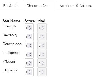
</div>Code language: HTML, XML (xml)That’s 6 attributes, each with a name, a score, and a modifier. It looks like this:
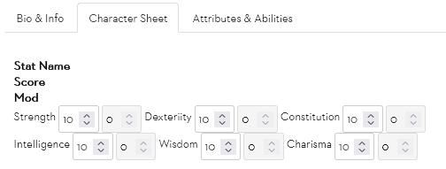
Turning that into a section with 3 columns is easy with CSS Grid. Just by adding this code:
div.stats {
display: grid;
grid-template-columns: 5em 3.5em 3.5em;
column-gap: 1em;
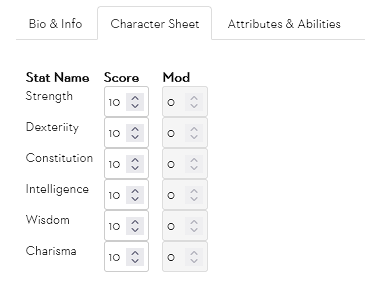
}Code language: CSS (css)And that’s it – with those 3 lines of code, the entire div is turned into a grid of 7 rows (with headings) by 3 columns.
How Does It Work?
First, adding the new display:grid property declares this element is a grid container, so you’ll usually add it to a div. Now everything which is a direct child of that container is considered part of the grid.
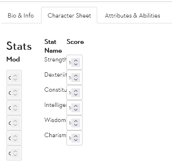
It only works properly on elements, so if you have naked text, you need to put it inside a span or other element. Imagine the grid div started like this:
<div class="stats">
    Stat Name
    Score
    Mod

    Strength
    <input type="number" name="attr_str" value="10">
    <input type="number" name="attr_str_mod" value="floor(@{str}/2-5)" disabled>Code language: HTML, XML (xml)
The CSS wouldn’t know what to do with that – you’d end up with this:
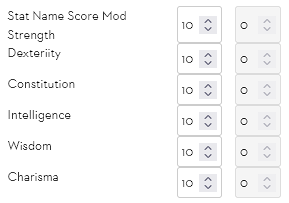
CSS tries but it isn’t perfect. The headings and first attribute name are all lumped together, and the width of that first column is a bit messed up. So you want to put everything inside an element – that makes it easier to add styling.
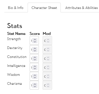
But the second line is where the magic happens: grid-template-columns: 5em 3.5em 3.5em. This is simply a declaration of how many columns there are, with the width of each. Remember that em is just a size (and 3.5em is Roll20’s default width for number inputs).
So, you enter a width for each column you want, and elements automatically organise themselves into that number of columns at that width.
Column Width and Troublesome Elements
On Roll20, Inputs and Selects often have their own width assigned, and that overrides whatever you have put in there. So you often need to directly assign a width that matches the desired column width. Imagine in the above column I wanted the last 2 columns to be 2.5em (about 30px). I could try with this CSS:
div.stats {
   display: grid;
   grid-template-columns: 5em 2.5em 2.5em;
   column-gap: 1em;
}Code language: CSS (css)
But that crushes the inputs together – they are still 3.5em wide, trying to fit into 2.5em columns and overlapping. But this can be fixed with a CSS declaration with enough specificity.
div.stats {
display: grid;
grid-template-columns: 5em 2.5em 2.5em;
column-gap: 1em;
}
.charsheet .stats input[type=number] {
width:2.5em;
}
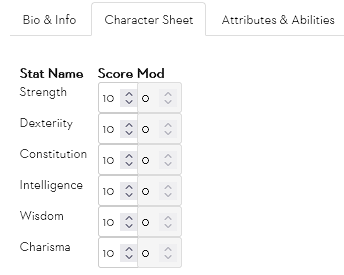
Code language: CSS (css)Admittedly that creates a new problem – but the inputs size properly now! (It’s possible to get rid of those up/down arrows, so the numbers are properly visible – the next post will show how to do that.)
Column-Gap
The third line, column-gap: 1em; is entirely optional. It simply declares a gap between columns, and what size it’ll be. If no column-gap is assigned, it is zero. I like to set it around 5px – that creates a nice, subtle separation.
Spanning Multiple Columns
Grid treats every element as part of the grid, which can be a problem. An easily fixable problem, but can throw you the first time it happens. Imagine the div started like this:
<div class="stats">
    <h2>Stats</h2>
    <h4>Stat Name</h4>
    <h4>Score</h4>
    <h4>Mod</h4>
    <span>Strength</span>Code language: HTML, XML (xml)
That turns the grid into this (and I should have put the columns back to 3.5 em):
That section header, Stats, has been added to the elements in the grid, pushing everything one step further, and messing up the order.
There are two solutions here. The first is to move the heading outside of the grid div – that might require the creation of another div to contain the new group.
Another solution is to declare that this heading takes up more columns:
div.stats {
    display: grid;
    grid-template-columns: 5em 2.5em 2.5em;
    column-gap: 1em;
}
.charsheet .stats input[type=number] {
    width:2.5em;
}
div.stats h2 {
    grid-column: 1 / span 3;
}
Code language: CSS (css)
By declaring that h2 starts at column 1, and spans 3 columns, it now takes up its proper place as a heading and the rest of the columns sort properly.
You can use grid-column for lots of things – to make individual items that are, say, 2 columns wide – just give them a class name so that you can target them with a selector. It has 2 components: the starting column, and the width in columns.
Likewise, you can use grid-row for making items that take up a number of rows – the syntax is the same, you state starting row and span is the number of rows. You can use both grid-row and grid-column for elements that span more than 1 of each.
Using Grid Areas
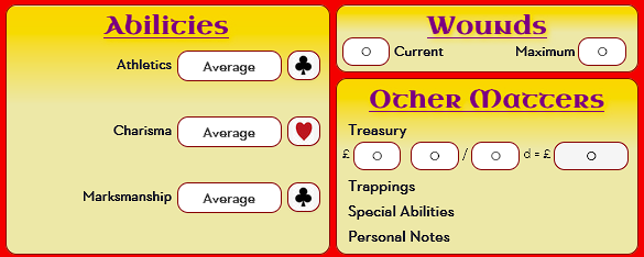
For grids with a complex shape (with multiple elements that span multiple rows or columns, you can define them in a very simple way with grid-template-areas. For example, here’s the Castle Falkenstein character sheet:
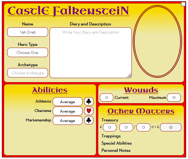
You can see there are several obvious blocks – the top half is the bio section , and the bottom section is split into abilities, wounds, and other. You could map them in grid areas like this:
div.sheet {
   display: grid;
   grid-template-areas: "bio       bio"
                        "abilities wounds"
                        "abilities other";
}
div.description {
   grid-area: bio;
}
div.traits {
   grid-area: abilities;
}
div.wounds {
   grid-area: wounds;
}
div.other {
   grid-area: other;
}Code language: CSS (css)
In the sheet div, grid-template-areas defines the sheet layout. It shows a simple map of the sections in the sheet. This isn’t to scale – you think only in terms of where each section begins and ends. The bio section takes up half the height of the sheet, but only one of three rows in the grid map – because that map is only concerned about differences.
Remember also that spaces are ignored – this could just as easily have been written as:
grid-template-areas: "bio bio" "abilities wounds" "abilities other";Code language: CSS (css)The spacing in the first version just makes it easier for the reader to see how everything connects.
Grid-Area
Once you have the basic layout, you need to identify the different grid areas. See how each div has a grid-area, and the name there matches the names in the grid-template-areas property.
When you do this, the elements slot into place automatically. The grid organises itself as if by magic. You can use grid-template-columns and grid-template-rows to set the width and wight of each section if needed – but if you don’t manually set them, they’ll get their values from the grid-area.
Nesting Grids
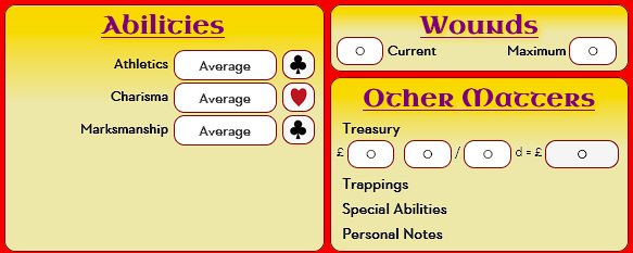
In the sheet in the above example, the whole sheet is a grid, but each section in the grid is also a grid. You can have grids within grids within grids. For instance, the abilities section starts:
div.traits {
   grid-area: abilities;
   display: grid;
   grid-template-columns: 145px 95px 30px;
}Code language: CSS (css)
grid-area identifies its place in the larger grid, then the next two lines define this div as itself a grid with three columns. This ability to nest grids inside grids is one of the most useful features of CSS grid.
Default Row Height and Column Width
By default, your browser will try to fit the rows into the space available, which can be a problem if you have more space than rows. Here’s a grid with just 3 rows below the title, and the browser has spread them out to try to fill the area.
That’s not ideal. You can use grid-template-rows to set the row height, but you might not always know how many rows there are, or you might have a lot of rows and don’t want to set the value for all of them.
That’s where grid-auto-rows comes in. This sets a default height, so if they are all the same you just need to set one value.
That looks much better. In this sheet, there are upwards of 20 abilities, but the player chooses which ones are visible. Having a default row height is much better than having to enter them all.
Display: Contents
This one’s a bit of a mind-bender. Normally grid affects only the elements one layer down – the direct children but not the descendants. But if you set display:contents on something, that becomes invisible to grid, and its contents get ordered by the grid.
To illustrate: imagine you have a set of abilities, each of which has 3 columns (just like above). But you want to use the Hide and Reveal Areas trick to hide entire abilities. You could put a hidden input before each element, but that’s tedious and wasteful.
Another approach is to put them all inside a div, and put display:contents on it. This means you control the visibility of that entire div with one hidden attribute, but the elements inside the div get ordered by the abilities grid. Here’s what that code looks like:
        <input type="hidden" name="attr_charisma_hide" class="hide" value="0">
        <div class="passthrough">
            <span class="bold">Charisma </span>
            <select name="attr_charisma" class="ability-rank no-arrows">
                <option value="12" >Extraordinary</option>
                <option value="10" >Exceptional</option>
                <option value="8" >Great</option>
                <option value="6" >Good</option>
                <option value="4"  selected>Average</option>
                <option value="2" >Poor</option>
            </select>
            <button type="roll" name="roll_charisma" class="nod20 ♥" title="%{charisma}"
                 value="&{template:default} @{show_name} {{ Charisma=[[@{charisma} + @{card_value}]] ♥ }}">
            </button>
        </div>Code language: HTML, XML (xml)
.passthrough {
display: contents;
}
.hide[value="0"] + .passthrough {
display: none;
}
.traits {
grid-area: abilities;
display: grid;
grid-template-columns: 145px 95px 30px;
}
Code language: CSS (css)Each Ability is made up of 3 elements – a span, a select and a button. They all inside a div (“passthrough”). The hidden input before it controls the visibility of the div, but if it is visible, the 3 elements inside it are sorted by the traits div’s grid settings.
Summary
That’s a lot of information, but each section isn’t that complicated on its own. There’s even more depth to CSS Grid, and if you need to, you can explore it in more detail. Try A Complete Guide to CSS Grid.
Properties in this Post
- display: grid and contents
- grid-template-columns: set the width and number of columns
- grid-template-rows: set the number and height of rows
- grid-template-areas: create a map of the elements in a grid.
- grid-auto-rows: set the default height of rows
- grid-auto-columns (like grid-auto-rows but for columns)
- grid-auto-flow: set the direction of the grid.
- grid-column: set the width in columns of an element.
- grid-row: set the height in rows of an element.
- column-gap: set the gap between columns.
- grid-area: set the location and size of an element.
Further References
- Andreas has created an example sheet using Grid.
Another great example of using Grid is found at Stone Age.(Doesn’t exist any more, which is a shame since it was an excellent showcase on CSS Grid.)