Every sheet is made up of HTML elements, whether they are divs containing simple text, or spans, labels, and inputs brushing up against each other. There are rules which govern how an element behaves, and those rules are derived from the Box Model of CSS.
The Box Model of CSS

Each element has a bounding box. It’s always a rectangular, box shape, and usually invisible.
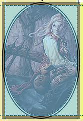
Here is a snapshot of an image on the page, which looks like it’s an oval shape. But alongside it is another snapshot showing the hidden bounding box, and the true shape – a rectangle.
Each box has four parts, from the centre to the outside edge:
- the content – whatever the element is: a div, an image, a paragraph, etc.
- padding
- border
- margin
CSS will accept a lot of different unit types for sizes. A lot more than listed here, but these are the most common:
- pt: The smallest unit, most commonly used borders. A pt is meant to be 1/96th of an inch.
- px: px stands for pixel, but this is “the magic unit” of CSS – the size varies with each monitor, but the browser tries to keep it roughly the same size. It’s a pretty good unit to use on Roll 20, generally.
- em: Relative to the size of the current font. 2em means double the font size. 1em on the web is typically 16px, but I think on Roll20 it is 13px.
- rem: rem is ‘root em’, it is relative to the size of the root font for the document. Where the size of em can vary from element to element (because they might have different fonts assigned to them), rem is a constant size throughout the document.
- %: percentage sizes. This refers to a per cent of the parent element’s height or width, as appropriate. I see this used more often with border-radius.
You can use different units in the same sheet, and even for the same property at different times. CSS will handle converting them internally. Here are some valid examples:
font-size: 13px;
height: 10rem;
margin: 4px;
border-radius: 10%;Code language: HTTP (http)
Which sizes should you use?
Roll20 uses px for a lot of its built-in unit sizes, so there’s no harm in using those. But as Roll20 works on support for mobile devices, it is probably a good idea to switch to rem for most things.
You can use them interchangeably – pt for one element, px for another, and rem for others.
Each element has a height and width. You can set them manually, or accept defaults.
Width by default is 100%, and height is auto (as tall as it needs to be to contain the contents).
Note that 100% here means 100% of the available width of the container. Say you have a sheet set to width:800px, and a div within it set to width:50%. That div is going to be 400px wide.
Max and Min
Note: if the size of your element varies (like a textarea, or you use auto or a % size), it’s handy you look into the min and max sizing options (max-width, max-height, min-width, min-height).
These will force those limits when appropriate. For example:
div {
   width: 60%;
   max-width: 500px;
}Code language: CSS (css)
This sets the width of the element to 60% of the width of the containing element, but if the player expands the window to a huge size, it’ll never grow below 500px.
Padding is the free space up to the border, and Margin is the added space outside the border.
This means that padding is considered part of the content, and takes its background properties (like colour), while margin is outside the object, and takes the background properties of the element’s container.
These are shorthand properties – you can set each side individually, or use a single property for all, or 2-4 properties and the units are applied in a specific order.
box {
    margin: 10px;               /* sets all margins to 10 pixels */

    margin-left: 15px;          /* set each margin individually */
    margin-top: 10px;
    margin-right: 15px;
    margin-bottom: 10px;

    margin: 10px 15px 10px 15px; /* top; right; bottom; left; */
    margin: 10px 15px 10px;      /* top; right and left; bottom; */
    margin: 15px 10px;           /* to and bottom; right and left; */
}Code language: CSS (css)
CSS has a lot of shorthand properties – you can use them or ignore them as you prefer.
You can specify a border size (the width), a style (solid line, dashed line, double line, and so on), and colour. You can also use a shorthand property that lets you assign all three at once.
border: 1pt solid black;

border-color: black;
border-width: 1pt;
border-style: solid;

border-right: 1pt solid black;
border-top: 2px dashed red;
border-left: 3% double green;
border-bottom: 4rem dotted blue;Code language: HTTP (http)
There are a lot more ways of addressing border properties – if you need something more complex, look them up.
Border-radius
A very handy property which lets you add a curve to the corners of the border. The oval picture above is border-radius: 50%, which means the curve of each “corner” takes up 50% of the length – if the height and width were equal, this would be a circle.

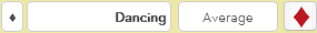
Another use of border-radius is to soften the edges of standard boxes, as with the input here. This used a small radius, border-radius: 2px.
You might need to calculate the size of an element. Say, you have a 100px wide space and are puzzled why your 100px input isn’t fitting in it. Maybe your input looks like this.
input {
   margin: 10px;
   border: 10px solid black;
   padding: 10px;
   width: 100px;
}Code language: CSS (css)
By default, height or width applies only to the content (in this case, the input). But margins, border, and padding are added to the size to calculate the space they take up. So here, the input itself is 100px wide, but the space it takes up is 160px (the padding, border, and margin at both sides).
Note: There is a box-sizing property, with a default value of content-box. You can change it to border-box, though you really shouldn’t. You can look it up if you need to.
Collapsed Margins
When you stack elements that have top and bottom margins, but no borders or padding, they can collapse. In this case, you don’t add the margins together but use the highest value. So, a bottom margin of 20 px and top margin of 10px produces a total margin of 20px.
Collapsing only happens in the vertical direction, and even 1px of padding or border stops it from happening. If your vertical sizing seems a bit off, check if this is happening and adjust padding or borders if needed.
Block and Inline Elements
Each element is defined as a block element, inline element, or inline-block element. For example, divs are block elements, spans are inline elements, and inputs are inline-block elements.
- block: Block elements always start a new line and take up the full width of their container. Examples include divs, paragraphs, and headings.
- inline: Inline elements don’t start a new line – they are inline. You cannot assign a width or height to them and they ignore vertical margins and padding. The best example is the humble span.
- inline-block: These elements are positioned like inline elements – they don’t start a new line. But you can assign all block-level properties (like size and vertical margins). The best example is the input.
- none: The element acts as if it doesn’t exist – it doesn’t appear on the page and takes up no space. Inputs with type=”hidden” behave this way, and you’ll sometimes manually assign this to elements.
An analogy I like to use is writing: block elements are the paragraphs, and inline elements are the words in a paragraph. And inline-block elements are specific words that are given extra emphasis (made bold, use larger text, or whatever).
You don’t need to think of display property very often, but there are times you might want to assign a different property.
You don’t need to think about display very often – you just have to remember how each element behaves. But every now and then you might want to change the behaviour of an element.
For instance, spans are inline aspects, but you might want to line them up with the inputs on the same row. One way to do this is to convert them to inline-block, so you can give them a margin-top value.
span.button {
    display: inline-block;
    margin-top: 4px;
}Code language: CSS (css)
This is just an example. There are other, probably better solutions. For instance, you could alter the line-height (more about that in the Text chapter), or adjust the top margin of the inputs instead.
You’ll often want to hide elements. Usually display: none; is used for this. See more on that topic in Hide and Reveal Things With CSS.
When using display: none, the element is completely removed from the sheet – it is as if it doesn’t exist at all. Sometimes you want to hide something, but make it clear something is there.
You can use visibility: hidden. This makes the element invisible, but it still takes up the space it does when visible. Then use visibility: visible to make it visible again.


A margin creates a gap between an element and its neighbour. A negative margin brings them closer together.
If you have one element with a margin-right of 10px, and its neighbour has margin-left: -5px, the actual distance between them is 5px.
This is a very useful technique to align inputs, selects, and spans – often they aren’t lined up properly, and adjusting margin-top is one way to get them to look neatly aligned.

CSS places a space on either side of inline and inline-block elements. After all inline elements are like words in a paragraph, and those words need spaces to be readable.
But this isn’t always desirable, and those spaces take up, well, space.
Imagine you want to create a row of boxes, and so create 4 divs, each with a width of 25%. Because of that added space, this is what you get:

But you want this:

One easy way to fix this is to apply a negative right margin, say margin-right: -3px. (The actual size might vary based on your sheet’s font size).
You can also set font-size: 0 on the parent element. Text at size 0 takes up no space, and that includes spaces (which are text)! But remember to restore a font size in the child elements, or the text there will not show up.
You can also use display:grid or display:flex, but those are big topics to be handled in their own posts (though, honestly, they are better solutions).
Properties in this article
- display
- margin
- border
- border-radius
- padding
- height
- width
- max-width, max-height
- min-width, min-height
- box-sizing: border-box and content-box
- visibility