Text is probably the most important part of your character sheet. That’s usually how you display things like a character’s name and their attribute scores, after all.
Each element that displays text (inputs, headings, textareas, etc) can have its text details set independently. That’s usually a good thing – headings should look different to regular text.
There are a bunch of properties you can use with text – some have the font- prefix, some have a text- prefix, and some have no prefix. Confusing! Here’s a sampling:
span.stand-out {
    color: red;
    font-size: 16px;
    line-height: 20px;
    font-weight: bold;
    font-style: italic;
    text-transform: uppercase;
}Code language: CSS (css)- Color and font-size accept the usual units.
- line-height is a very important property if you are changing the size of fonts. While font-size sets the size of text, line-height sets the height of the lines that text is on. A good number is around 25% bigger than the font-size.
- Font-weight can be bold, bolder, or lighter (or units of 100 up to 900: 100, 200, 300, etc.).
- Font-style can be normal, italics, or oblique (which is just another style of italics).
- text-transform controls capitalization – it can be uppercase, lowercase, or capitalize.
Font Shorthand
There is a font shorthand property. You can combine many (but not all) properties that start with font- in the same declaration, like:
span.stand-out {
    color: red;
    font: 16px bold italic;
    text-transform: uppercase;
}Code language: CSS (css)
When using the shorthand, you must include a font-size.
In my experience, this suffices:
h4 {
    text-decoration: underline;
}Code language: CSS (css)
That sets a basic underline to the h4 element. It doesn’t have to be any more complicated than that.
But there’s a lot more to underlining text. You can choose the style of the line, how thick it is, and whether it’s under or over the text. There are four properties:
- text-decoration-line: The placement of the line; can be none, underline, overline, or line-through.
- text-decoration-color: accepts all colour units.
- text-decoration-style: What kind of line. it can be solid, double, dotted, dashed, or wavy. The default is solid – if you don’t declare anything, that’s what you get.
- text-decoration-thickness: can be auto, from-font, or any size unit.
You can use the shorthand property text-decoration to set all of them at once.
There’s also a rare property, text-underline-position, which can be under. The browser tries to place the underline close to the text, but letters like g and y can hang through the line. use this property if you need to create some extra space. (It only works with underlines, not overlines.)
What if you want to make a specific word bold, or red, while the surrounding text looks ordinary? This is the kind of thing spans were made for. Here’s a span inside some other text.
<p>
  Here's a <span class="text-example">very green</span> example.
</p>Code language: HTML, XML (xml)
And here’s the CSS for that span and what it looks like.
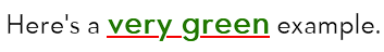
span.text-example {
    color: green;
    font-weight: bold;
    text-decoration: red solid underline;
}Code language: CSS (css)
That’s also a good example of underlining the letters and g (see last tab). Here’s what it looks with that obscure property:
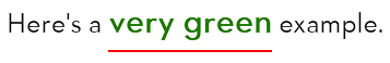
span.text-example {
    color: green;
    font-weight: bold;
    text-decoration: red solid underline;
    text-underline-position: under;
}Code language: CSS (css)
Text-align is a very useful property and can have these values:
text-align: left;
text-align: center;
text-align: right;
text-align: justify;Code language: CSS (css)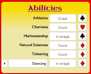
In the Falkenstein sheet, you can see I’ve set the alignment of most text to center, and ability names to justify.
label, input, button, select,
textarea, span, p, h3 {
   text-align: center;
}
.abilities span,
.abilities input {
    text-align: right;
}Code language: CSS (css)
The card suit images are parts of images, and so are arranged with other properties.
The default value is left, so you might never need to set it. But headings often look better centre-aligned.
Using fonts in web pages has always been difficult. Fonts are stored on the user’s computer, so what happens when your webpage declares this text should be in a font the user doesn’t have?
People noticed there are some fonts that almost everyone has installed, regardless of what device they are using. These are websafe fonts (fonts that are safe to use on the web). You can find one list of websafe fonts at W3 Schools.
Another solution to this problem was to create the ability for browsers to load a font file, so it can be viewed by anyone who visits the page. Roll20 takes security very seriously and doesn’t allow the loading of external files, so this simply wasn’t an option here. Roll20 did supply five custom fonts for all users: Arial, Patrick Hand, Contrail One, Shadows Into Light, and Candal, and some special icon fonts. You can try these out to see what they look like.
To solve the problem of fonts on the web, Google created the Google Font list and made it easy for all browsers to access them. Roll20 recently added the ability for sheet authors to use them.
So the situation for roll20 authors is this: you can use the five Roll20 fonts, websafe fonts, and can import Google Fonts. With that explanation out of the way, how do you use fonts on Roll20?
Basic Fonts
Declare your fonts where you want to use them using font-family.
h2, h3 {
   font-family: 'Patrick Hand', 'Trebuchet MS', Arial;
}Code language: CSS (css)
If the font name has a space in it, put it in quotes. You can (and should) declare multiple fonts at once. The browser will try to load the first, and if it can’t, it’ll work through the list till it gets one it can load. The fonts are called fallback fonts. Make sure you have a safe font at the end.
Google Fonts
Using a Google font has one extra step, you need to import the font. At the start of your CSS file, have a line like this:
@import url('https://fonts.googleapis.com/css?family=Tapestry&display=swap');Code language: CSS (css)You must use this syntax, not the syntax Google suggests on their page.
If the font has a space in it, replace it with the + character, and if importing multiple fonts, separate them with |:
@import url('https://fonts.googleapis.com/css?family=Tapestry|Uncial+Antiqua&display=swap');Code language: CSS (css)There are a staggering number of Google Fonts to choose from. You can browse them all. Someone (I don’t know who, or I’d credit them) has curated a list suitable for roleplaying games here: Google Doc of Fonts.
Falkenstein Example
The Falkenstein sheet only uses a special font in certain headings, and so sets up its fonts like this:
@import url('https://fonts.googleapis.com/css?family=Uncial+Antiqua&display=swap');
h2, h3 {
   font-family: 'Uncial Antiqua', Arial;
}Code language: CSS (css)
If you want to apply an outline to text, you can’t use the border or outline properties- those apply to the element containing the text, not the text itself. This is where text-shadow comes in.
That can be declared like this:
h3 {text-shadow: 0px 0px 2px gold;}
h4 {text-shadow: 0.1em 0.1em 0.05em red;}Code language: CSS (css)
Text-shadow creates a copy of the text, overlays it on the original text, and applies some effects to it. The text-shadow declaration is made of four parts in order:
- How far the text copy is moved, in the horizontal direction
- How far the text copy is moved, in the vertical direction
- The radius of the blur effect on the copied text.
- The colour of shadowed text
Your text-shadow might have smaller or larger values for any of these for different effects. The first three are size units; the last is a colour.
This is a complex topic so I might add a post on the topic later, with examples, but for now, your best bet is to google it and experiment. Here’s a good place to read an introduction to text-shadow.
By default, an element will grow to accommodate the text within it. If you have set a size, the text might overflow the container. Here is a simple example.
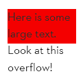
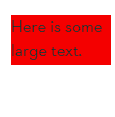
Most of the settings are obvious. The scrollbars are too large here, purely because I chose large text and a small container for ease of making an example. overflow: auto tries to add scrollbars only when necessary, so it’ll usually add them to one side, but which side depends on the elements involved.
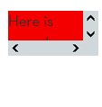
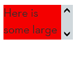
Note that overflow also affects images, colours, and other properties. For example here is a wide di inside a narrow one, with and without overflow.
<div class="tall">
    <div class="wide">
        <!-- ]resumably something goes here -->
    </div>
</div>Code language: HTML, XML (xml)div.tall {
background:palegoldenrod;
width: 100px;
height: 100px;
}
div.wide {
background-color: red;
width: 200px;
height: 50px;
}Code language: CSS (css)Here is tall div coloured pale gold, and a wide div inside it in red. The inside div sticks out.

Here, the tall div has overflow added, so the part of the wide div sticking out is cut off.

If you use per cent sizing, be careful of how you arrange your elements. Let’s say you do this:
p, span {
  font-size: 200%;
}Code language: CSS (css)
And then you have something like this:
<p>Here is some <span>example</span> text.</p>Code language: HTML, XML (xml)Take a moment to think about what will happen. Here’s what actually happens:
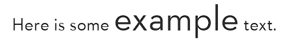
The span is inside the p(aragraph), so it gets the font-size multiplier applied to it twice. That may be what you want, or it might be a nasty surprise.
Properties On This Page
- color
- font (and font-size, font-weight, font-style)
- line-height
- text-decoration (and text-decoration-line, text-decoration-color, text-decoration-style, text-decoration-thickness)
- text-align
- import google fonts
- font-family
- text-shadow
- overflow