- Getting Started With CSS
- Removing the Dice Icon In Buttons
- How Elements are Displayed
- Images and Colours
- Text and Fonts
- CSS Grid Layouts
- Understanding Selectors
- How To Hide and Reveal Things With CSS
- Inheritance and Specificity
- Your Own Styles on Roll20
- Advanced Positioning
- Character Sheet – CSS Example
Several elements on Roll20 are tricky to style (for example, number inputs and roll buttons), but armed with our knowledge of Inheritance, Selectors, and Specificity, we can now figure out how to handle them. And do a few other things besides.

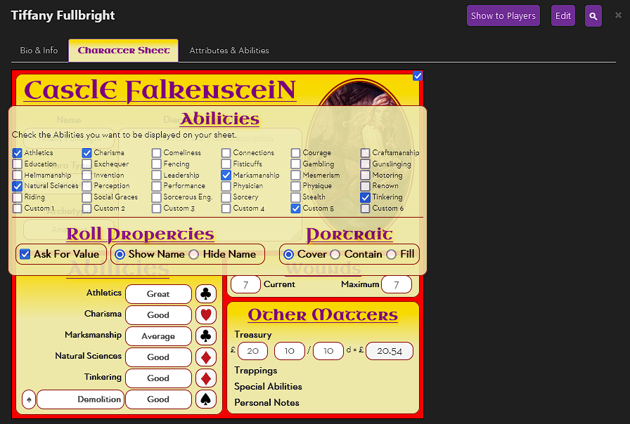
As described under Inheritance, the entire sheet is made up of divs and other elements. In the Castle Falkenstein sheet, I created a single div to contain everything, and gave it the class=”sheet”. In the image to the right, you can see that div and all of the elements above that. They are in Roll20’s own HTML sheet which we can’t edit.
We can’t edit the HTML, but we can add our own declarations to affect some of the CSS. Roll20 has a security model that makes sure some classes and elements are out of reach to us (we can’t use body or HTML for instance). This is a good thing. If we could affect any element, we could affect things outside of the character sheet – like the chat window or the toolbox – and we could accidentally make Roll20 unusable.
But there are still quite a few we can modify. See the two I’ve put in red boxes? Those are classes that some Roll20 declarations use (mainly inputs), and we can hijack those declarations and override them.
When you want to override an existing element, just inspect the element and find out what selectors it has – then add your own with at least enough Specificity as it has. The .charsheet and .ui-dialog are great classes to add – they already exist in the sheet so that’s a free extra +10 or +20 specificity just by adding them to the start of your declaration.

For example, when I inspect a number input on the Castle Falkenstein sheet, here are the styles I see.
.charsheet .sheet input[type="number"] {
  width: 2.8em;
  height: 26px;
  padding-top: 1px;
  padding-top: 2px;
  font-size: 1.2em;
}
.ui-dialog .charsheet input[type="number"] {
  width: 3.5em;
}
input[type="number"].no-spinners {
  -moz-appearance: textfield;
}
.ui-dialog .charsheet input {
  height: auto;
  vertical-align: middle;
  -webkit-box-sizing: border-box;
  -moz-box-sizing: border-box;
  box-sizing: border-box;
}Code language: CSS (css)
The declaration block at the top has been added by me, and the one below it was created by Roll20. I’ve created a declaration that has the same specificity as theirs (31), so I could override the width: 3.5em. I reused the .charsheet class, and I could have added the .ui-dialog class as well if I needed to.
A common suggestion online is to include a CSS Reset in your CSS file. The concept is simple: if you want a standard look for your sheet, you can declare a bunch of style values right at the start. For example, part of a CSS Rest might look like this:
html, body, object, iframe,
div, span,
h1, h2, h3, h4, h5, h6, label {
  margin: 0;
  padding: 0;
  border: 0;
  font-size: 100%;
  background: transparent;
}

input, select {
  vertical-align :middle;
}Code language: CSS (css)
But on Roll20 this is complicated by two things:
- First, many HTML elements are not valid here (everything on the first line in the example above should be discarded). So you’d need to prune suggested lists and add your own.
- Second, the inbuilt styles. For some elements (mainly inputs), you can’t simply include any declarations you want and assume they’ll work. You have to make sure their specificity is at least equal to that of the inbuilt styles. So the second declaration block would need a lot of extra text to handle the inputs
That said, a CSS Reset is still a good idea, and you can see the Castle Falkenstein example sheet starts with one.


A very common desire is to modify the look of the Roll20’s roll button. You can see the standard look on either side of this text. Kind of meh.

The trickiest part is removing the existing button. So let’s find out how Roll20 creates the button.
This isn’t easy to find, because it’s hidden in the ::before pseudo-class. This is basically saying, “add this symbol before whatever the author types on that button.”
The content, t, is being added, and in that font, the t looks like a dice image. We can use our knowledge of specificity to remove it by adding a declaration with content: “” to override it.
.ui-dialog .charsheet button[type=roll]::before {
    content: "";
}Code language: CSS (css)
Text Button
If you want the user to click, say, a skill name to launch the button:
<button type="roll" name="roll_example" value="/roll whatever">Some text</button>
You might want to make the button appear invisible. The box-shadow rule here is easy to overlook and gets rid of faint lines around the button.
button[type=roll] {
   border: 0;
   background: none;
   box-shadow: none;
}
New Image Button
If you want to change the dice image:
button[type=roll] {
    background-repeat: no-repeat;
    background-position: center center;
    background-size: contain;
    background-image: url(https://i.imgur.com/j0clYEV.png);
}
button[type=roll]:hover {
    background-position: center center;
}
Roll20 does a weird transition when hovering over a button which spoils your image. The hover declaration fixes that.
You can add your own colours and styles, but that’s a straightforward application of CSS.
There are some elements and classes you can not use – if you try, either Roll20 will simply ignore them or everything will stop working. You can see a list of such elements and classes at the excellent Roll20 Wiki.
There are also some classes you can use but shouldn’t. The .bio and .abilities classes are used by Roll20 in the Bio & Info and Attributes & Abilities tabs. So don’t use those classes.
But you can use this knowledge to make some changes to the character sheet interface – changes that are properly unintended but work anyway.
For example, using a bit of CSS I made some subtle changes here: notice the reduced space between the top tabs and the sheet itself, the alignment of the left side of the sheet with the tabs, and the colour of the active tab.


You can get a lot more ambitious than this, but it’s a good example of what you can do.
A very new feature (at the time of writing) in Roll20 is Dark Mode. Unfortunately, this presents a challenge for Sheet Authors. You can either create a different colour scheme for when Dark Mode is on, or make minor tweaks to correct problems in the sheet colour scheme created by dark mode.
Dark Mode created 3 problems for this sheet: it made a big white area in the background, the text in the tweaked tab is unreadable, and the text under Roll Properties and Portrait is very faint.

Fixing these took some inspection of the sheet. First, I made the background transparent, so it matched dark mode, and then I darkened the text in other places.
.sheet-darkmode form.sheetform  {
    background-color: transparent;
}
.sheet-darkmode .ui-dialog .nav-tabs > li.active > a {
    color: purple;
}
.sheet-darkmode .characterviewer label {
    color: black;
}Code language: CSS (css)
If you want to handle dark mode in your sheet, you’ll need to decide what you need to change, and make sure you include the selector “.sheet-darkmode” in your CSS rules (notice for people who have paid attention to CSE and Legacy modes, this does need to have sheet- at the start).
The ever-useful Wiki has a useful page here: Dark Mode.
Reference
Most elements are overridden by a single element (specificity 1). But some elements have inbuilt styles that need more specificity than that – mainly the different kinds of inputs.
Here are the selectors that some of the CSS declarations use (for instance, number inputs have width=3.5em at the top, and other selectors under the various other property declarations listed):
| input[type=number] | .ui-dialog .charsheet input[type=number] .ui-dialog .charsheet input .ui-dialog input input[type=text] input |
| input[type=text] | .ui-dialog .charsheet input .ui-dialog input[type=text] input |
| input[type=checkbox] input[type=radio] | .ui-dialog .charsheet input .ui-dialog input Input[type=] input |
So if you want to override everything for a text input you’ll want to include something with at least 21 Specificity (2 classes and 1 element). Remember you can use the exact declaration listed.