Abilities
The biggest section of the character sheet is the Abilities list, so we’ll tackle that first. This is the biggest part of the article!
The RAW HTML
The HTML takes up quite a bit of space. It starts like this:
    <div class="traits">
        <h3>Abilities</h3>

        <span>Athletics </span>
        <span>♣</span>
        <select name="attr_athletics" class="ability-rank">
            <option value="12">Extraordinary</option>
            <option value="10">Exceptional</option>
            <option value="8">Great</option>
            <option value="6">Good</option>
            <option value="4" selected>Average</option>
            <option value="2">Poor</option>
        </select>
        <button type="roll" name="roll_athletics" value="**@{character_name}}** tests **Athletics**nPoints: [[@{Athletics} + @{card_value}]]">
        </button>

        <span>Charisma </span>Code language: JavaScript (javascript)
The elements list continues a long way, with four elements for each ability. We need to apply a CSS Grid to this to arrange the elements into nicely ordered columns.
It’s very common to add a title attribute for abilities, like title=”@{courage}”, so that can players can figure out what the attribute name to use is in macros. I haven’t done that here since I’m using the ability name as the rank – players can easily guess what that is.
.traits {
    display: grid;
    grid-template-columns: 80px 15px 90px 30px;
    column-gap: 5px;
}
.traits h3 {
    grid-column: 1 / -1;
}Code language: CSS (css)
That will sort everything into four columns. That heading at the top of the div will ruin the arrangement. But grid-column can be used to set a start and end column for an element. Using 1 / -1 means it spans from the first to last column – the full width. That takes care of the arrangement of columns.
Note On Class Names
There are certain names you should not use for classes because Roll20 is already using them. In the first version of this code, class=”traits” was class=”abilities”, but that was messing up the Abilities section on the Attributes & Abilities tab. Some class names to avoid are bio, attributes, & abilitiies.
The Select Is Too Wide and Then Too Narrow
That mostly organises everything, with the exception of the select.

The select is wider than the grid column assigned to it. This is either because roll20 has some styling already applied. So we have to override that, which we do with this:
.traits select {
    width: 80px;
}Code language: CSS (css)
This resizes all selects within the abilities section. But there is still a problem.
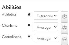
There are some words that are too big to be displayed. That’s easily solved by making the select a bit wider. (There are also some ability names below those shown here that are too long, so I fix that at the same time.)
I also decide to get rid of those dropdown arrows. Unfortunately, different browsers require different code for this. A quick google search later, and I have the code to do that:
    -webkit-appearance: none;
    -moz-appearance: none;
    text-indent: 1px;
    text-overflow: '';Code language: CSS (css)
I test it in Chrome and Firefox, and all seems to be well.
Fixing The Row Height
It’s still not perfect though. The gap between each row is a bit too large for my taste. I do some hovering over HTML code to figure out what is causing the problem, and find this:

Those Buttons are Very Specific
I’m not happy with the button appearance and plan to make a change to them later, but I check out what the code is now. Roll20 has some built-in styling.
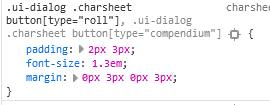
See how it has a very specific (high specificity) style, but I can copy that to override it.
.ui-dialog .charsheet button[type="roll"] {
    padding: 0;
    font-size: 1.3em;
    margin: 0;
    height:25px;
}Code language: CSS (css)
Lining Everything Up
As is ever the case with CSS, the job is never done. I notice the elements aren’t lining up horizontally. Fiddling with padding or margin is usually the solution here. I add a top margin to spans inside the abilities class to push the spans down a little. Now my code looks like this:
.traits {
    display: grid;
    grid-template-columns: 100px 15px 90px 30px;
    column-gap: 5px;
}
.traits h3 {
    grid-column: 1 / -1;
}
.traits select {
    -webkit-appearance: none;
    -moz-appearance: none;
    text-indent: 1px;
    text-overflow: '';

    width: 90px;
    padding-left: 0;
    margin-bottom: 2px;
}
.traits span {
    margin-top: 3px;
}Code language: CSS (css)
That lines up spans, select and buttons up quite nicely, I think. You can see from the screenshot on page one that there are a few more changes to this section to come, but that gets the basics of the layout done for now. Time to move on to the Bio.