Wounds, Belongings, and Other Stuff
Wounds
While creating this version of the sheet, I realised I forgot to include a Wounds section on the HTML version. We can fix that now.
I want boxes for current and maximum wounds. But Falkenstein has a way of calculating maxim that is a bit too complex to handle here (it uses a lookup table), so I’ll just leave boxes for players to enter the total into and leave the calculation until next month’s section on Sheet Workers.
Here’s the HTML. I want a title row, and the rest on a single line. I have an idea for arranging the wounds, so I give the spans each a class – left and right.
<div class="wounds">
    <h3>Wounds</h3>

    <input type="number" name="attr_wounds" class="no-spinners">
    <span class="left">Current</span>

    <span class="right">Maximum</span>
    <input type="number" name="attr_wounds_max" class="no-spinners">
</div>Code language: JavaScript (javascript)
I used spans for the labels Current and Maximum. Many people use labels for text labels like this, but I don’t like the default formatting, and labels are intended for use with checkboxes and radio buttons.
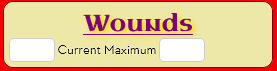
But spans have a problem – they are inline elements, which means they don’t work with the width property, making it hard to arrange them horizontally. This is what it looks like by default (with a bordered wounds div).
But this is easily fixed, by adding display: inline-block. They now respect the width property, but what width to use?
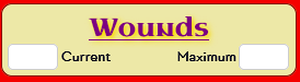
I decide to make the first label left-aligned, and the second right-aligned, so there’ll be a nice empty space between them, like this:
I could find the exact width for each span, but CSS can calculate that for me. I know Roll20 sets number inputs to 3.5em by default, so I can use calculation function by setting the width of each span to 50% of the container, minus the input. It ends up being a bit wider, because there’s other things like margins to take into account.
One final wrinkle is spans and inputs aren’t usually the same height. By adding a top margin to the inputs (to “pull them up”) I get the nice layout shown above.
.wounds .left,
.wounds .right {
    display: inline-block;
    width: calc(50% - 3.9em);
    font-weight: bold;
}
.left {
    text-align: left;
}
.right {
    text-align: right;
}

.wounds input {
    margin-top: -5px;
}Code language: CSS (css)
Money
The width I’ve chosen for this section makes it easy to add four number inputs here – for pounds, shillings, and pence, with a total pound value. The latter will be an Autocalc.
This is very simple, except that number inputs by default have spinners (those up and down arrows at the right side of inputs). They take up a lot of space, so it would be nice to remove them. A quick google search later produces the code to do that. One of the pages has the code converted into a reusable class, and that seems handy so I add that.
That code looks scary because different browsers work differently and we have to accommodate them.
/* hide up/down arrows ("spinners") on input fields marked type="number" */
.no-spinners {
    -moz-appearance: textfield;
}

.no-spinners::-webkit-outer-spin-button,
.no-spinners::-webkit-inner-spin-button {
    -webkit-appearance: none;
    margin: 0;
}Code language: CSS (css)
I can now copy that code into the CSS of any sheet, and just add the no-spinners to any number inputs and the spinners will be automatically hidden.
Details
Now, I want players to be able to enter extra details for their general equipment carried, special equipment, and special abilities. In Castle Falkenstein, other races might be played like dragons and faeries, with abilities like Flight and Glamour, and players need a place to record them. (There are better ways to do this, with Repeating Sections, but we aren’t at that point in the guide yet.)
The rest of the sheet is turning out to be compact, so I don’t want to take too much space up with this. And this is where the details element comes in.
<details>
    <textarea name="attr_trappings" placeholder="Enter Equipment Carried"></textarea>
    <summary>
         <h4 title="click me to reveal space for writing">Trappings</h4>
    </summary>
</details>Code language: HTML, XML (xml)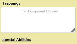
With a little CSS for formatting, this now looks like this:
In normal use, only the heading is visible, but players can click it to reveal a textarea to enter details.
It would be handy to have some styling on the heading when its details section is open, and you can do that with details[open], so I add this (for now, I add more styling later):
.other details[open] summary h4 {
    color: gold;
    background: red;
}Code language: CSS (css)
That makes the title row (the h4) stand out when active.